
Author Archives: ktabrahams
Evaluation of my work experience
I did my work experience at a secondary school (The Folkestone Academy Glassworks) within the sixth form department, focusing on mainly the photography students, but also helping and guiding the art, graphics and textiles students when the wanted my help/advice. I was there for 10 days 9.00am-3.15pm. I really enjoyed my time there, the 10 days went really fast and would have loved to stay there longer. I chose to do work experience at a secondary school as when I finish university I would like to be a teacher teaching photography. The work experience was really useful in my opinion and defiantly was worthwhile doing. It made me see what it was like being a teacher and whether I would like it or not. I can defiantly see myself being a teacher in the future I have the patience and understanding of it all. Whilst on work experience I got to teach and support the students, I didn’t think they would pay much attention to me or even listen to what I had to say, as to them I’m not much older than them and I’m not a teacher. However, this wasn’t the case and they took in what I had to say and most of them always asked for my advice and help in a situation, they felt my time useful there and worthwhile. Not only did I help the students, but I also helped the teachers there improve their department by making it better and easier for them. Both the students and the other members of staff gained from me being there and learnt something new that they didn’t necessarily know before. I learnt a lot whilst I was there, I learnt how to mark students work and the process of it all, and look through there work and give them feedback and advice on what to do next with their project. I learnt how to give them advice and support they needed, I learnt how to plan lessons for the students that I thought was beneficial for them. The main part of what I learnt from being there was that I defiantly know I want to be a teacher in the future. Whilst I was at work experience I mainly was there to support the students, I planned workshops to do with them, and I gave them advice and how to improve on their work. Most the students gained from me being there and have a better understanding of certain things. For example, the process they should be doing when it comes to their work, how to use Lightroom, how to set up the studio correctly and what camera settings they should be having their cameras set to. Most the students were lacking at these things and I think me being there has made them improve on these things. I didn’t just help the students though, I helped the department by coming up with an idea to help the issues with cameras and equipment being stolen. I created a sheet for them and the students to follow by, this should them help them with the issue and if anything does get lost or stolen they know who had it last. I tidied up the department and made suggestions on how they can improve, I changed all the camera settings so they were set at the right format for the student to work with and so their pictures come out a better quality. I looked through their darkroom stuff they recently order and gave my opinion on it all and what else they need to get before getting the student to start using it. Overall I am really happy with my choice of work experience, it has beneficial for me, and I have now got a better understanding of it all and made me want to be a teacher even more. It has inspired me, and I have enjoyed teaching the students and given them the knowledge I have to help them and make their work better.
Day 10 (04/05/18)
Today is my last day of work experience. I have had a good two weeks here, it has gone really fast. Today as it is the last day before the student has the exams. I will be around for any help and support they need, and any advice they want regarding their exams. I was I the same situation they are in now, so I have experience in what the are going through. There wasn’t much to do as they are all focusing on their work ready for their exam Tuesday. I did, however, go round and ask the students if there were any materials they needed for their exam. Only a couple of students needed materials for their exam, most the other student’s work was computer based. Even though today was quiet I enjoyed being around for the students to ask me questions and being able to give my advise and support. I think they found it useful.
Day 9 (03/05/18)
Today I started the day by helping a student with taking photos of her graphics work. She had made a t-shirt and wanted it to photograph it using a model. So I helped her set up the studio to how she wanted the lighting, I then set up the camera to the right camera settings for her. I then got her to take the photos with me being around for help and guidance. I helped with how she should have the model standing/posing and adjusted the models clothing so it would look best it can be for the photo. This shoot was successful and the photos come out really good considering she doesn’t do photography. She found my help useful and was happy with how all the pictures turned out.
Next, I sat in lessons and was around for students ask for my help. The students are quite independent and are stressing out as they have their exams coming up next week, so they like to be left alone.
The student I helped out in the morning went through all the photos from the shoot and now wanted my help to edit them, so I guided her through this process. I then sat with her for the rest of the day and gave her my help and guidance with what she is doing for her project.
Day 8 (02/05/18)
Today I started the day by given the graphics student advice and help with their work. They have their exam coming up so we got them to write everything they need today and what days they plan on doing things, just so they have an idea and are organised when it comes to the exam. The next lesson was photography where I showed a student how to work in the style of an artist she was looking at. She was looking into an artist where they cut away and places objects on top of their work, the student was working in the same way so I showed her how to do this. She first printed the image out on normal A4 paper, but the paper kept ripping so I suggested for her to print out on thicker paper to make it easier for her. This worked a lot better and ended up with two different design which both looked really cool. I have place pictures of her work below.

The student I was working with yesterday came back from taking photos, so I got him to sit next to me so I can keep an eye on what he is doing and to help and guided him through his work. He got a lot done and made progress in his work. He finally is working in the style of the artist that he’s been looking at.
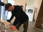
Once the photography class was over I went through a box with all the film and darkroom stuff in it. The school wants to set up the facilities so the students can work and develop film. I looked through all the chemicals etc that they ordered. Most of it looked fine but I emailed John Sullivan to double check and see he opinions on things. He told me all about the different pieces they have and said it was fine, just to take the school through some bits before they start using them. John Papworth then took me up to look at the enlarger to get my opinion and what he needs to add. There were parts missing and told him what he needs to get for it to work properly for the students. I also gave him a chart to use when it comes to developing the film. I have placed pictures below of all the equipment they bought and how I helped.


Day 7 (01/05/18)
Today I only had a photography lesson, which me and the teacher teaching, went round each individual student and went through their work and their targets that were given to them. We asked what they are doing and how they are going to meet their targets given, and how to possibly make their work better to get better grades. This went well and all the students seemed to be doing what they were supposed to be doing. We both gave ideas on what students could do to improve even more and what they should possibly do next. One student is far behind and doesn’t seem to be doing much, but he seems to listen to me and does do what I tell him to do and if I sit next to him and guide him through his work he does loads of work in within in a lesson. I told him to plan a shoot in London as he could get loads of images from going up there that links to all the artists that he has put in his sketchbook.
For the rest of the day, I planned what needed improving within the department and suggested what they could do to give students more ways of experimenting.
Overall today went well and I’m glad students are listening to what I have to say and are doing what I tell them to do.
Day 6 (30/04/18)
Today was a quiet day due to not many students being in because of the weather. So I didn’t get to do much. Because of the free time and not doing anything I did some of my work for my university. I still was available for the students to come and speak to, and for them to ask me questions. Towards the end of the day, I did an experiment for one of the photography student, who is looking into the artist Debbie Smyth, who uses string to create an image. The student is currently using wood and nails to recreate it. However, is finding the nails are too big and keep falling out. I suggested using foam board with small pins. I did an experiment to show the student. I did this by using the foam board and pins to see if it would turn out any better than using wood. It worked perfectly, it was more secure and looked a lot neater as the pins were smaller. It was also a lot easier to work with as you could put the pins in closer together.
Day 5 (27/04/18)
Today was a busy day and was filled with different lessons all day. I started the day in the art room helping the students, as this was an hour and a half lesson, I asked John Papworth what he would like for me to do with the photography students today. We came to an agreement that the student’s Lightroom skills needed improvement and should know why they need to use it more, and how it can be beneficial to them. So I planned a workshop to do with them using Lightroom. Whilst I was waiting for the photography students to have their lesson as it was towards the end of the day, I tidied up the camera cupboard and changed all the camera settings so they were on the right camera settings for the students. I changed them so the camera shot in RAW and JPEG as some of the computers at the school can’t handle the RAW files. I also changed it so the colour space was set to Adobe rather an SRGB. Once I did that and had lunch it was then the photography students lesson. John got them all settled in and to open Lightroom ready. When the students were all here, I then began, I started taking them through Lightroom with all the different adjustments they can do. I showed them three different types of images, one image was oversaturated, one was black and white, and one where it was overexposed. I chose these three images as they can see that they don’t have to necessary delete the image, they can edit an image in Lightroom in so many different ways. I also showed them they can save presets on Lightroom. This was because some of the students are taken ages to edit a shoot and tend to edit them all in the same way. This should then speed them up and enable them to get more work done. Once I showed them the basics, I saved the three images to the shared area for the students to work with. I told them to open the three images on Lightroom and play around to see if they can make them look any better. This lesson was only and 45min lesson so they didn’t have much time. But I walked around and helped any students that got stuck and needed my help. The students have done really well and all found it useful. The next lesson was graphics, for this John Papworth took me through the marking process and explained it all to me. He then got some students over one by one and got me to look through their work and mark it on how it currently is. He also told give and set feedback on what is going well and what could be improved. This was interesting to learn and a good way to see how they mark the students work. Overall this has been a productive day and went really well. I have learnt new things and taught the students new things. This week has gone really fast and I have enjoyed each second of it. I am looking forward to next week as well.
Day 4 (26/4/18)
Today I didn’t start until 10.30am. This was due to the teacher not having a lesson till that time. I started the day sitting in with both year 12 graphics and year 12 photography. These two lessons coincide with each other and are in the same room. I focused more on the photography students, and went round any students I didn’t get a chance to work with the other day. I helped one boy out that was stuck on where to go next with his project. He wants to focus his project on work people and what they use to work with, so close-ups of there tools etc. I suggested looking at artists that take photos of work people specifically, just to show the examiner that he has thought about different ideas for his project and different ways to photograph it, not just focusing on one thing and having one idea. I showed him some work of people I knew who do a similar thing to what he’s planning on doing. This helped him a lot and said he now has an idea on where to go next with his project. Next, John Papworth asked me to look at this one student work focusing on water as he knew I experiment with that at some point. I showed her the images I did, she wanted to know how I did the shoot with flowers in ice cubes, so I explained how I did it and how she should do it. I also gave her ideas on what to do next and advice on her current work.
Whilst looking around I noticed the students were stuck on editing their photos in Photoshop, so I suggested to john that I take them through editing photos on Lightroom and this will be better and quicker for them, as they can save presets for editing their images. He agreed this was a good idea and to take them through the process tomorrow with them.
For the rest of the day, I looked around the art and textiles students work. I gave them ideas and tips for them to use. The textiles students exam is coming up so gave them tip and advice on that because I was in their shoes a few years ago. One thing the teachers want the art and textiles students to do is to photograph the process of their work and know how to take good pictures of their final pieces etc. So I went round to the students one by one with a camera and showed and explained why they should photograph each stage of their work and how to do it in the best possible way. I explained to them that showing the examiner the process makes them understand their work better and that they may possibly get better grades by doing this. I showed and explained how they should photograph their final pieces and to show as much detail as possible. The student took all this on board and I even made them have a go at taking photos themselves.
Synthesise of my understanding of my own work.
• What topics interest you, both visual and contextual? and why?
The topics that interest me visually and contextually are ones that I have never done before or that I have come across. I like learning about new things and learning new techniques. I like a challenge and to experiment with my work to get the best possible outcome. My work is at it best when I’m combing new research and techniques into works I have learnt before. One topic inarticulacy that interests me the most is looking into artists that use film, and experimenting with it in ways of using it and developing it. I like the process that happens when using film, I like the rawness of film and the grain it has to the quality of the image. I like that you have to make every shot you take count and not knowing how it turns out until you develop it.
• What particular themes arise from or are dealt with in your work?
Some particular themes that arise from or are dealt with in my work are documentary and mixed media. Most my work is documentary based it always tends to document something. I also seem to always come back and used mixed media by laying images together. All the work I produce is made by a different alternative photographic process. For example salt printing, cyanotypes, black and white and coloured film. I like to experiment and learn new techniques. I like sticking to the formal elements of photography, by focusing on colour, aperture of my images and exploring different techniques and differences between them all.
• What is the link between your theoretical work and choice of research and your practice?
As spoken about throughout within the previous questions, the themes that connect my practice together is documentary and mixed media. The elements that tie my work together when it comes to an idea is the research into the idea, there is always a strong link between that and the final piece that I produce. I translate that idea into a finished piece by combing the research I do to link into my own practice. The research I do always helps me produce my work further and give me new ideas on what to do with the project. When it comes to the theoretical research I use the books that Francis might recommend to me and what he might show us in our lectures. I also go into further research by finding books using the library, to widen my research and ideas on what to produce.
• What approaches do you take to developing your work (consider both practical elements and contextual), in other words what stages do you tend to go through to develop, realise and communicate ideas? Is there a pattern to your process?
When it comes to developing my work, the approaches I take are researching into what my chosen theme is, researching artists that link to my theme, then researching artist within the style I want to work with. I then explore and experiment in similar ways to the artists I have looked at, and maybe even combing some artists together. I then combine the work that I have experiment with, with my own style until I get the outcome that I am happy with. I like my work to look unique and different, so I develop it and play around with the process until I’m happy with the overall outcome. I’d rather develop and explore different ideas for my work and have loads of ideas I can work with, rather than having one final idea that may not be the best. In my opinion, developing the woradverticsing k you create in different ways shows myself and viewers that the final outcome is at the best it can possibly be. I enjoy the approaches I take when it comes to developing my work, it means I am learning to things all the time, both practical and contextual.
• If you were to assess your approach in both areas, what do you feel works and what doesn’t? and where do you see the need for development?
If I was to assess my approach to my work, I feel that how much I research I do towards the development of my work is strong, and really well, there’s always strong links to my artists and my work. There are clear concepts and ideas and you can clearly see them throughout my work. However, one thing that I think I can do to improve is time management, I have loads of ideas when it comes to development but sometimes I don’t necessarily get time to physically do them.
• Where does your work sit in terms of genre and the creative industries? Think about the strengths of your working practices as well as interest – and whether these fit? And why
In terms of genre and the creative industries, my work sits mainly within the documentation genre. The work that I produce documents a certain topic whether this being myself, religion, or even the environment. This is changing all the time to fit into the creative industry and to suit me and what I like. Looking back at some of my old work you could say my work also sits under advertising. My images were very editorial based and could definitely be used in/for magazines, books, websites and other forms of media.
• Where do you see your career heading?
I see my career heading into teaching, I enjoy teaching others and showing people different techniques they haven’t learnt before. I think not having a style to my work and being able to explore all element of photography, helps me with going into teaching. I will have an open mind when marking and looking at other peoples work, and it won’t be bias opinion, as I will understand different peoples styles. I will be able to teach them all different techniques and give them my honest opinion on their work. Doing work experience at a school has shown me I could possibly be a teacher. The students engaged with me and liked all the different ideas I gave them.
Day 3 (25/04/18)
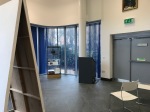
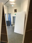
At the begging of the day today, I sat in with the graphics class. I showed John Papworth the powerpoint I created for the workshop today and he really liked it and agreed with me about the students lacking in their studio skills. I started to set up the studio so it was ready for the workshop for photography students later on. Below I have placed images of the set up I created in the studio.


Whilst setting the studio up, a student came to me 1 on 1 and asked how to set the studio up with using flash. I showed her how to do this, she didn’t realise how easy it was to set up. When the photography students came in I didn’t end up doing the workshop as there were students who needed to use the studio, so I am going to do the workshop another day. There were a few students that weren’t in the other day so I went through their work and gave them ideas on what they can do. One girl wanted help to shoot in a film noir style so I told her ways in which she can do this, and gave her three different way she can do this. She took them on board and is planning to do a shoot in the next couple of days. Another student I spoke to was struggling on where to go next, so I ask what he liked doing and what was his style, he told me and I gave him loads of artists to look at which might give him an idea on what root to take with his project.
One student is focusing on shadows and silhouettes and showed me what he is interested in doing. I had an idea for him to used sun-sensitive paper, and placing objects on top of it to create silhouettes. I tested this out before showing him what he could possibly do as some development and show different techniques in his work. He seemed up for the idea but was busy doing a shoot so wanted to do it another day. Below are pictures of the test sheets I experimented with. On the left-hand side is the one I left under the UV bed for 5 minutes, and on the right-hand side is the one I left under the UV bed for 2 minutes.


Day 2 (24/04/18)
At the beginning of today, I had a year 13 photography class. For this class, I sat down with the students and went through their work individually, I managed to give them advice on what to do next and what other artists they can look at. I manage to give them at least two other artists to look at. The year 13s are currently looking into their exam question, some of them have chosen to do the exam question with silhouettes, and are looking at doing photoshoots with casting shadows over people and film noir. As they are keen on doing this I said I will do a workshop in the studio with them playing around with shadows and lighting. I told them to bring in props that they can use for the shoot. Looking at some of the other people work I noticed that they are lacking their knowledge in the studio, and their images aren’t as good as they can be. They are using the wrong settings on their camera and they are taking the image of how they want it to look rather than having it better quality and editing it they way they want after. One girl, in particular, did a shoot in the studio but made her settings so her images were dull and hand really cool colour tones them. This made the images lose its detail and made some parts of the image really dark. I suggested she reshoot and maybe experiment with different light and flash, I offered to help her and to show her how to set up the studio properly.
For the rest of the day, I planned some workshops to do with the students, this was due to the teacher I shadow has to go to the other site to teach on this day. I have placed a link to the powerpoint I created below. Even though for most the day I was on my own I felt it was still constructive as I planned to do workshops for the students that I haven’t done before. I enjoyed planning for this and look forward to the actual workshop itself.
lighting in the studio
Day 1 (23/04/18)
Today I didn’t start until 10.30, as the teacher I am with had a meeting. I started the day by looking through some of the year 12 photography students InDesign workbook. I made note of what they can do and what could be improved. When looking through the work I have noticed the students had a lot of spelling mistakes and their grammar was pretty poor. Looking through their work more, they don’t have a lot of artist research and it’s mainly all from Pinterest. They need help with annotating their work, they are either writing to much and taking up a lot of there time in just writing or they aren’t writing enough and the pages are looking bare. They also have loads of images from Pinterest and not enough images of their own. They don’t have a flow to there work and their work seems to have jumps where they are looking at something new. From looking at their work, I will maybe give ways on how the students can annotate their work better and what they should be writing and what they shouldn’t. I could show them layout designs and show them a better way of formatting their work.
The next lesson was then graphics which I looked around at students work and gave them advice and help on what to do and where to go. Once I looked around all the students work, I then looked around the photography department and gave suggestions on what could be improved. The head of photography John Papworth said he had trouble with students not handing the cameras back in, and stealing some of the camera accessories. He showed me what the process was for students to take the cameras out. I then suggested a way which might help him and involves the students signing out the cameras before they were allowed to take them. He was keen on this idea and thought it was really good, he asked me to design a sheet for them to fill out which I have placed bellow.

He was happy with this and is putting it to use straight away. The next lesson I had was art. Where I again looked through the students work and gave them advice. There was one boy who particularly was struggling, he was doing a drawing in the style of an artist, but because he wasn’t looking at the artists work while doing it, so didn’t look like the artists work at all, I told him this and suggested that it might be a good idea to start again and maybe use a different image. He was up for this and straightway done it. Whilst looking through he work it reminded me of a couple of artist that he could use and work with, he likes all of the artist i suggested as said he was going to look into them and research into them more.
This then took me up to the end of the day, overall the day went pretty well, I think I fitted in pretty well and the students adjusted to me well and were happy to talk to me. I think I gave them good advice and helped them with their work. I also helped the photography department with their issue with the cameras.
Timetable for the next 2 weeks
Below is a picture of the timetable I will be following for the next 2 weeks of work experience. I will start at 9.00am and finish at 3.15pm every day. On Tuesdays and Thursdays where I have a gap, I will plan workshops for the students to help them with there work and also design posters to help them remember camera setting etc for in the studio. The rest of the time I will be in the classroom with the students. I am sitting in photography year 12 and 13, graphics year 12 and 13 and art. I will be looking through their work and given advice and my opinion on their work so far.

Emailing the work placement
On this page, I have placed evidence of the emails sent and received from the work placement. I have emailed the Folkestone academy vice priceable of the glasswork (Simon Himbury) to ask for 10 days work experience with them. I emailed him twice and didn’t hear anything back so I went into the school and asked to talk to him. He was happy to have me for work experience, he just had to double check with the head of art/photography. He emailed back in a couple of and said it was all okay. Below are the conversations I had with him regarding the paperwork and etc. I also had 3 meetings with him going through all the paperwork and what I will be doing whilst on my work experience with them. I can’t wait to start I’m really looking forward to it. I will be starting on the 23rd of April and be finishing on the 4th of May.
-

- Email 1
-

- Email 2
-

- Email 3
-
- Email 4
-

- Email 5
Research into work experinace
When researching and looking into work experience, I first wanted to work with a freelancer photographer. However, when given it some thought I decided against the idea, as I wouldn’t be doing much and that’s not what to do when I leave university. As I want to be a teacher when I leave university teaching photography, I thought it was a good idea to do work experience at a school within the photography/art department. This will give me experience in working within a school and teaching students and give me an idea what it will be like to be a teacher. Once I was happy with my decision I then started emailing around to find a work placement.
Evaluation
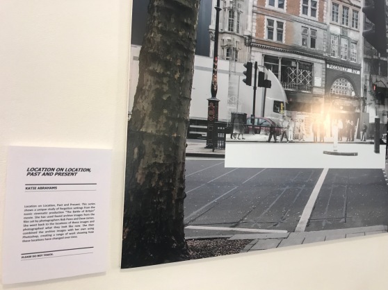
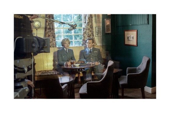
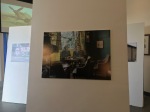
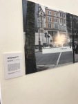
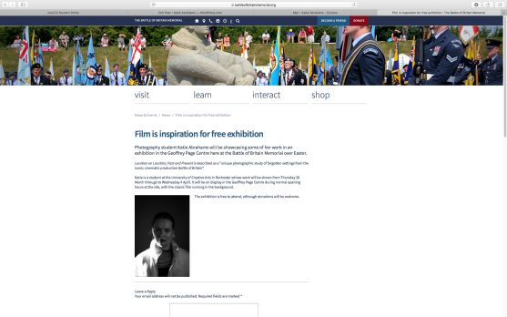
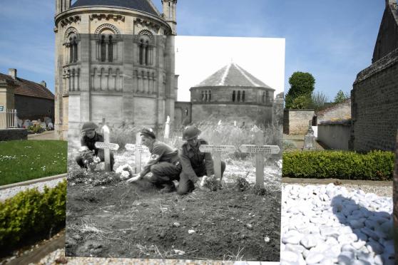
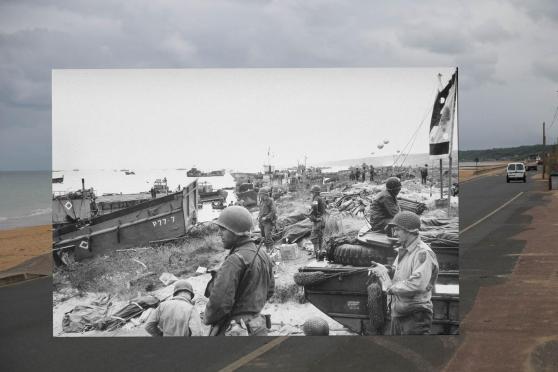
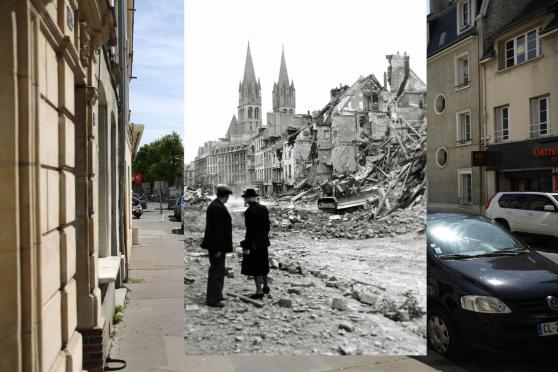
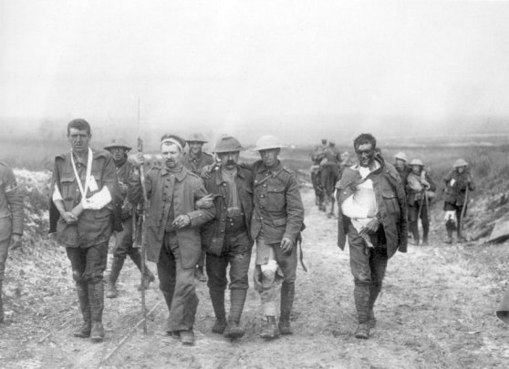
On this page, I have written my evaluation for my project named ‘Storytelling’. I have placed my final images at the bottom of the page. I think the images I have created and the exhibition I have but on all link really well to my brief that I was given. I have used archive film stills from the Battle of Britain movie, gone back to photograph the locations where they were shot to show people what they look like now. I then layered these images together using Photoshop. I have chosen to do this technique to the images as it really puts across to the viewer how much has changed over the years, its a story within a story. The film stills are of a story, the people you see acting are creating a story and I have taken images of a new story. It is a frame, within a frame, within another frame. This links well to the storytelling brief in my opinion.
I had the film stills sitting in my room, and I knew I wanted to use them for this project as I thought it would link really well with the brief. However, at first, I didn’t know what I wanted to do with the images. So that’s when I started researching into artists that link to war photography, and came across the following artists Don McCullin, Ernest Brooks, Cornell Capa, and Robert Capa. I also searched for the photographers who took the film still from the movie these were Bob Penn and David James. Below are some images of the artist’s work.
-

- Don McCullin
-

- Ernest Brooks
-

- Robert Cappa
-

- Cornell Capa
I then came up with an idea to layer images together so that’s when I researched into artists that layer images and rephotogrpahy. I then found the following artists that layer images together, Nicky Bird, Christopher Rauschenberg, Mark Klett, Sergey Larenkov, Peter Macdiarmid, and Harry Enchin. Below are some images of the artist’s work.
-

- Nicky Bird
-

- Christopher Rauschenberg
-

- Mark Klett
-

- Sergey Larenkov
-

- Peter Macdiarmid
-

- Harry Enchin
Once I did research on some artists and went through all the film stills that I knew I wanted to work with. I went out and took shots using a digital camera. For these shots, I used my Canon 750D. I instantly knew what I was doing as I was comparing to a photograph I already had. However, I knew I need the weather to be nice for my images to turn out right. I needed it to be a bright day so I had as much light as possible when taking the photos as most the fills still are on bright clear sunny days. This was hard due to the snow. However, I managed to get through it. Below are some images from these shoots. I have chosen one from each shoot I did.


Once I was happy with my images I took, I then edited them using Lightroom. I then got the film stills from the film and layered them on top of my own images in Photoshop. Using the erase tool and playing around with the opacity and that I then started blending the two images together. The technique I used worked really well and the images all looked amazing.
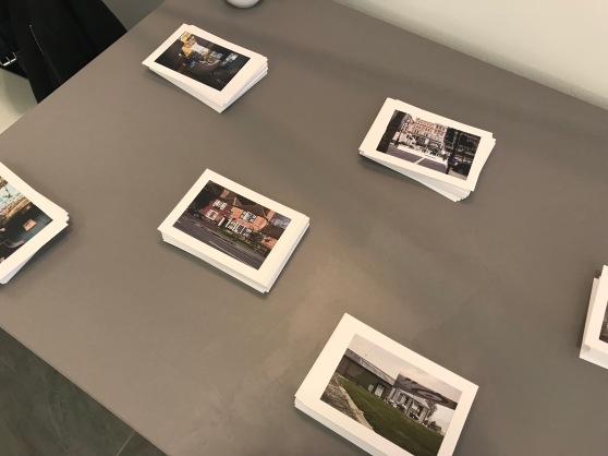
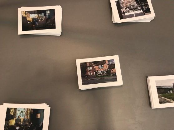
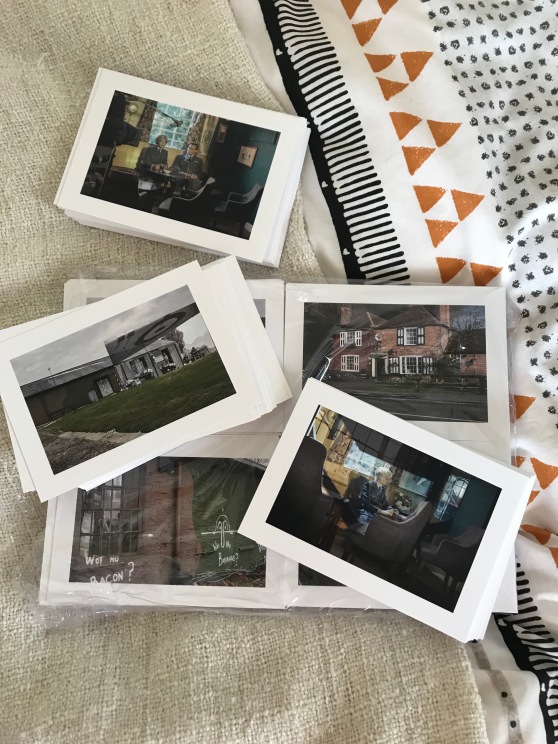
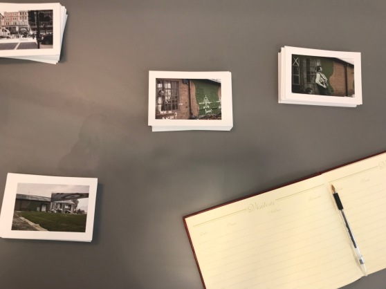
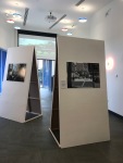
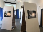
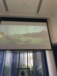
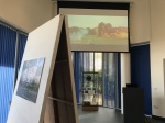
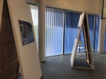
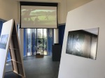
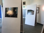
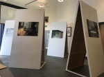
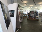
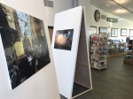
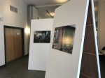
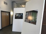
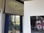
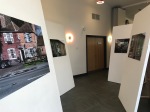
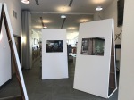
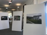
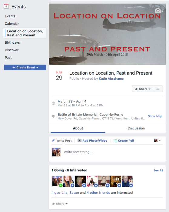
While doing all of this I also had to organise an exhibition, I chose to do this at the battle of Britain memorial in Capel-Le-Ferne. I managed to get the space for free and get help with making posters etc. The people were really friendly and worked around me. The dates I picked for the exhibition was the 29th of March till the 4th or may. This was so it fell on Easter holidays and coincided with the 100 years of the RAF. I did this because I knew this would be the busiest time, as people would want something to do over Easter. I managed to market my event effectively, I made a facebook event, and got it shared by the creative quarter. I put out flyers and posters and was even on the venue’s website. I think I pulled the exhibition of really well on my own, and I really enjoyed doing it. I had great feedback about my work and the audience loved it. It was a great experience for me and the people who viewed my work. The exhibition itself consisted of seven A1 images presents on 8ft by 3ft A-frames, which worked well in the space as it was a large room with high ceilings. I had the film also playing in the background on a drop-down projector, I put chairs out so people had the option to watch it. At the side I had a table where I was selling postcards and where the visitor book was and for people to come and ask me questions. Below are my final image and some images from the exhibition.


Overall I am really satisfied with how this project has turned out, and I think the exhibition and my images were a success. I have pushed myself to make sure it was the best it can be, and am really happy with the overall result. The only thing I might have changed from this experience was to give the audience more detail about each individual image by putting at stamens next to them.
The Exhibition
Regarding the event as a whole, the overall exhibition seemed really positive with comments by most people saying they really enjoyed the work and thought it was well presented and made. It coincided with the 100 years of the RAF which also drew people in. They loved the film being played in the background and it really drew attention to the work. The visitor’s book had only positive comments from the audience and had a range of people from all over the world including Lativa!
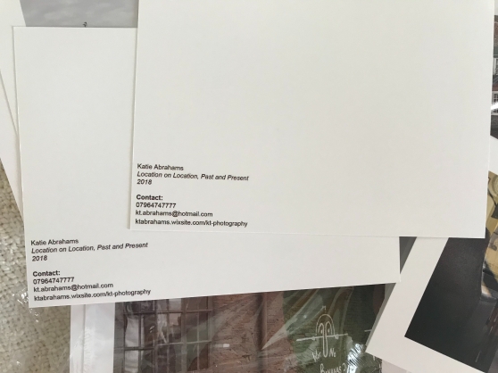
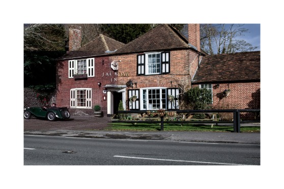
The postcards I made were also well received, providing relative information about myself (websites, social media, email). People also wanted them to put in frames, as they enjoyed my work that much. Overall I sold 54 postcards, the most popular one being the one of the Jackdaw pub. I let the venue have most the postcards that were left over to sell on themselves. I have kept some so I can also sell them also. I would defiantly make postcards again for future exhibitions people liked the idea and it allowed the audience to leave with a small yet professional memento of the event.
With this, no accidents happened while exhibiting. People took care and flowed around the space how I wanted them to, making sure children were behaving and not running in and out of the boards. The statement that I provided the audience was informative and any questions they had I answered and explained. I even found out stuff about the film I did not know, as some people who came to look at the exhibition helped out on the set of the film. The only negative feedback i had was that people would have liked to know where the places were, where I took the photos so they can go there themselves to have a look.
To improve the exhibition, I should of possibly should have given more information about each image, by putting a small statement next to the image. However, as a whole, I am pleased with the response I had, and how well it went. I fell that I can confidently put on and organize my own show in the future. as at first, I didn’t know how people would like it. I’m so happy I chose to put on an exhibition rather than making a book.


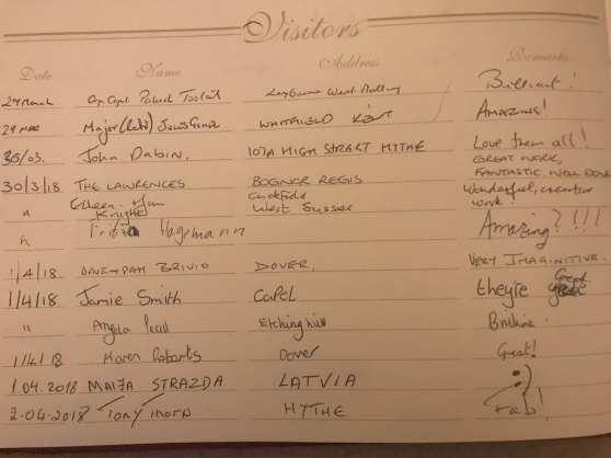
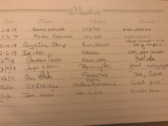
Visitor Book
While I was exhibiting, I put out a visitor book for people to sign, I got loads of great comments and positive feedback. Below are pictures of the comments people put.
Printing Statements And Postcards
When it came to printing the Statements And Postcards. I actually printed and mounted my Statement my self on to foam board. For the postcards I got them printed out at a local printing shop where I live called Folkestone Printings. I got 350 postcards for £70 which I thought was not too bad. I probably don’t need 350, but it was cheaper for me to by more than it was for me to buy less. I am happy with the quality of the prints, and would definitely use them again in the future.


Artist Statment
This is the Artist Statement I created to tell people more about my project, and the exhibition. I will put this on the first image people see when entering the space.
Postcards
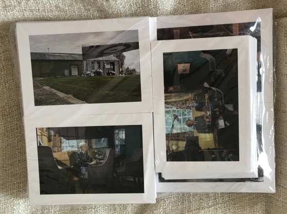
I have decided to make postcards and sell them at the exhibition for £1 each. Below are the designs of the postcards which I created. I have decided whatever money I make from the postcards I will donate to the trust, as they let me had the space for free and helped me with making the flyers etc.


Installation
Below are some photos/evidence of my install day. It only took me the morning the day before the opening day to set up in the space, as we made sure everything was ready before we moved it in. I painted the boards the weekend before so they didn’t have any marks on them, and I knew they were going to be dry. We attached the hinges and the supports to the boards the day before we were moving them down to the venue. The only thing we had to do was set up the A-frames into the position I was happy with, and apply the command strips to the boards ready to hang my prints on the day. For this, we measured so the center of my images were eye levels to viewers, this meant we measured 155 up from the bottom of the boards. As you can see from the images below everything went smoothly and it looks really good. I was so happy with how it looked. I set it up so people could walk freely around the boards and they had to look at them again when walking back out. I think how I set the boards up, in the end, was really effective and drew the audience in more.

Costs Of Exhibiting
venue – £0
posters/ flyers – £0
A-frames – £0
Foamboards – £20
printing – £105
mounting – £35
Postcards – £70
command strips – £20
ARTIST CHECKLIST
Putting Out Posters/Flyers
I managed to put out a whole range of posters and flyers local to where I live. This ranged from the town I live in, to where I work in tontine street and the actual venue its self. I had loads of people interested in the event where I work. People were picking up the flyers all the time and we actually ran out. It was good having them where I work as I could then explain to them a little bit more about it. I know the venue had the flyers in the cafe and in the main reception as well.
Curation & Installation Strategy
Prior to installation, the room I plan to exhibit in must be presentable beforehand. This means I needed to Allow time for general cleaning (where necessary and with care to the building) whilst notifying Jules (the manager of the battle of Britain memorial) what days I wanted to start preparing. Regarding the space, the battle of Britain memorial has tall ceilings and is fairly modern, with different kinds of lighting to light up my work, I have natural light from the windows, which can be controlled by opening and closing the blinds, I have lights from above and on the walls which can be turned up or down using the controls.
On the day of the install, I will need a van to help transport materials and equipment. I will get a friend to help me as I won’t be able to lift and set up on my own as the A-frame boards are heavy and need to people to lift them.
I will exhibit in the Geoffrey Page Centre at the battle of Britain memorial. I will present my final pieces using four A-frames. These will be installed scattered separately across the floor space, they will have one image on each side of the boards (pictures being A1). The battle of Britain film will also be played in the background on a projector that the venue already has in place. I will set up the boards so people can walk freely around them and it has a flow to them. Allowing the viewers to look at the images in full detail. Going back on themselves if needed. I will also set a table up in the corner for people to sign the visitor book and buy postcards.
My work will look really good in the space, as everything links around the venue, and the exhibition dates also coincide with the 100th anniversary of the RAF.
Website
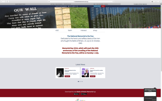
As a different way of marketing, I got the venue to put information about the event on their website to gain more interest. Below is a link to the venue’s website and the event they added. I have also put screenshots below.
How To Exhibit The Work
Here I have done added Sketch-up design on how I want to display the work, I have taken screenshots to show you what I plan it to look like and how I want to set it up.


Possible Hazards At The Venue
The only possible hazards there might be when exhibiting will be:
- If people trip over the A-frames
- If the A-farmes aren’t secure properly they may fall over
- little kids running in and out of the A-frames and falling over/the A-frames fallen on them.
- If people lean of the A-frames and they fall over
How can we avoid any of the above happening?
To prevent any of the above hazards happening, I will make sure the A-frames are secure and stable, so they don’t move or fall over if touched. I will also put a sign saying ‘please do not touch’. As I’ll be there every day I will be able to keep an eye for anything dangerous to happen and be there to advise the parents/gardens it isn’t good for the kids to run in and out of the A-frames.
Marketing – Facebook
When it came to marketing I created an event on Facebook, with all the details about the event. I shared it on the uni page, and photography page and sent an invite to the event to everyone I thought might be interested in it. I also got people to share it on their facebook, so more of a wide range of people knew about it. I posted it on local selling groups as well as there are a lot of people signed up to the sites and get notifications when something is posted on there. It got a wide range of attention and people who said they were interested in the event. Below is a link to the event.
https://www.facebook.com/events/1701703856534797/
Marketing – Creative Quarter Folkestone
When it came to marketing my event, I got in contact with the Creative Quarter in Folkestone and emailed them to share the event on their facebook, and for me to hand them some flyers to put out on their desk. They emailed back and were happy to do that, they shared my event on facebook and twitter and had flyers to hand out to people. I chose to ask them to share my event as they are art based and have a lot of people on there social media looking for things to attend and that are art people based themselves. They also share other peoples work on their social media all the time and get quite a bit of interest from it. Below are some photos to show evidence of what I have done.


Final Images
Beneath are the final images I want to use for my exhibition. I think I have a good number of images to use and think they will look good in the space I have chosen. They all work well together and all catch the viewers eye. I’m really satisfied with how these have turned out and can’t wait to see what other people think about them.


Combing Images
Below are some images of me combing the images from the film stills with my own images. I did this using photoshop and using the blend tool. Overall I think all these images are really effective and they are all strong images to use. I am really happy with how these have turned out. They are blended well together and they are well made. I think these will look amazing blown up and put on in an exhibition.


Test shoot 4
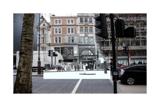
This is the fourth shoot I have done. For this shoot, I used a digital camera. I traveled up to London and to the old Aldwych station that is no longer in use. I really like these images. I love how the buildings around the station are all a dull brown then the station is bright red, it really draws the viewers eye to the station. The colours in these images are really bright and eye-catching. Overall I am really happy with how this shoot has turned out.


Test shoot 3
This is the third test shoot I have done, again I used a digital camera. These images have turned out a lot better than the first test shoot I did with using the film camera. I can get a lot more in the frame and it looks the way I wanted it to. Overall I am happy with how these images have turned out and there are strong images that I think I will be able to use for my project.


Test Shoot 2
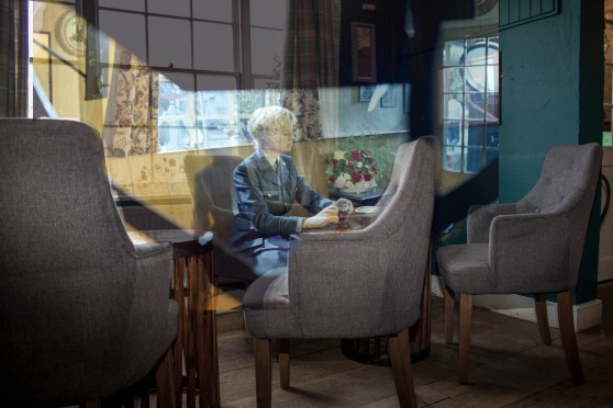
Here is the second test shoot I have done, this time I have used my digital camera. For these images, I have used available light and also experimented with flash. for this location, I went back to the Jackdaw pub in Denton. The images have turned out a lot a better than they did in film. The layout and format is better and the lighting is better. Overall I like how these images have turned out think they are really effective. However, I don’t like the ones in the garden with the snow. I don’t think I will be using them at all for my project.


Test shoot 1
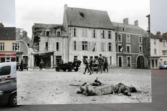
This is the first text shoot I have done, I used the Bronica camera. I went to two different locations, the first 6 images are from the Jackdaw pub. The rest of the images are located in Hawkinge, at the Battle of Britain Museum where some of the film was set. I like the images I have shot, however, don’t like the camera I chose to shoot with. I used the wrong lens and the square format doesn’t really fit into what I plan to do with the images. My project is about past and present. However, I feel I should use a digital camera to show how the quality of images has changed over the years.


Films Stills Box 3
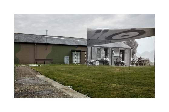
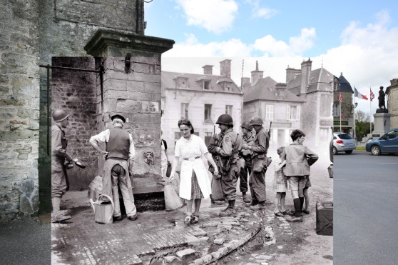
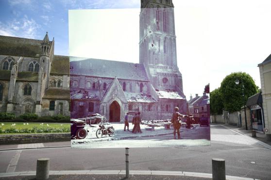
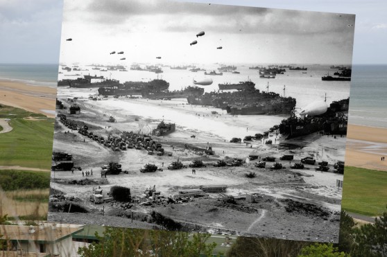
Here is a selection of the archive images from box 3. The images you see below are the ones I think I can use for this project. I have a range of photos I could possibly use. Most of these images from this box are taken at the battle of Britain museum and Hawkinge, these are easy locations to get to, to do a shoot. I will have to ask permission at the museum.


My beautiful picture

My beautiful picture

My beautiful picture


My beautiful picture

My beautiful picture


Film Stills Box 2
Here is a selection of the archive images from box 2. The images you see below are the ones I think I can use for this project, and go back to the same location and shoot. I have a range of photos I could possibly use. Most of these images from this box are taken in London at the Aldwych station, where I am planning to do a shoot.
However I did some research on the station and you can’t get down to the underground, so I will have to take the photos from outside the station.


Film stills Box 1
Here is a selection of the archive images from box 1. The images you see below are the ones I think I can use for this project. I have a range of photos I could possibly use. Most of these images from this box are taken at the Jackdaw pub in Denton, where I am planning to do a shoot.


My beautiful picture

")
")


Poster Design
Here on this page is some poster designs I came up with for the exhibition. The first 6 images you see are the ones I came up with. I sent these over to the venue to get their approval and see which one they wanted to use. They got back to me and said they like the last one but wanted to make it fancier. We came up with the poster at the bottom of the page. It’s a lot better than the previous ones I came up with. It is more eye-catching and has stronger colours and information on it.


Andreas Gursky – Hayward Gallery
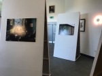
Today I went to look at Andreas Gursky work exhibited at the Hayward Gallery in London. Below are some pictures I took of the exhibition. I really like how he laid his images out. They were in a simple frame with a white border around them. I admire the range of smaller images and bigger ones and ones that take up the whole wall. In my opinion, this makes viewers walk around the whole exhibition, and make them study each photograph closely. He makes the pictures that contain loads of detail bigger so viewers could see every detail possible. My favourite image out the whole exhibition was the one where the two teams were in the stop pit at formula1. He had to be quick at taking this picture as they are quick when changing the tries etc. I like all the small detail in this image and how he has also captured the people standing in the box above them. I like how the image is dark, but the red and white really makes the image stand out.


Battle of Britain movie
Here are some screenshots from the Battle of Britain movie (1969). I have screen-shotted the elements that I plan to go back and rephotograph.


Installation Reaserch
As I won’t be able to hang anything on the walls and the space is big, I feel I need to make the most of it and need to build stands to put my images on. Below are some ideas I have in mind of what I want t to do when it comes to exhibiting.


Open Eye Gallery
Sketch Up of Floor Plan
This is the sketch up design of the floor plan of where I’m putting on the exhibition.


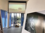
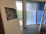
Battle of Britain Memorial Visit
Here are some photos of the space which I will be putting on my exhibition. Everything in the room will be taken out so it will just be an empty space.


Emailing the Venue
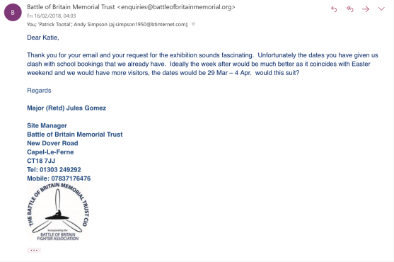
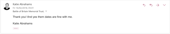
I emailed the battle of Britain memorial team about putting on an exhibition and the dates I was thinking of putting on the show. As you can see from the attached emails I have placed below, I explained what I wanted to do and told them who I am. They were really keen on me putting on a show and gave me the dates that they thought would be best (Easter weekend), which should mean I get a really good turn out. I went up and had a meeting with them to explain and go over stuff. They are letting me have the room free of charge and helping me with promoting and making posters for the event. The exhibition will be on from the 29th of March till the 4th of April and be from 10am-5pm. They also have a projector in the space I’m exhibiting in, they are going to play the battle of Britain film (1969) on it. I am so happy with this and can’t wait to get started.
Exhibition Idea
For this unit I want to put on another exhibition, I have chosen to do this over a book as I think it will work out a lot better and I don’t think I have enough content to make a book. I think putting on the exhibition in the venue I want will link everything together nicely. Where I live the battle of Britain is popular, and also the film is a big hit. So putting on an exhibition which contains images of what people love will hopefully bring in a wide range of audience, with lots of people.
I planned to exhibit in the battle of Britain memorial is Capel-Le-Ferne, Folkestone, or the battle of Britain museum in Hawking. I went to look at both venues, however, felt battle of Britain memorial was more suited and had more people come to visit it, as its recently been done up, and had the queen come to attend the opening. The room which they showed me also had a lot of space to work with. The battle of Britain museum was too small and there wasn’t enough room for me to do what I plan on doing.
Harry Enchin
Harry Enchin is a photographer from Toronto. He hit on the idea of using photo collage as a way to link the old and the new, to bridge the decades, to evoke memory through art. Enchin went through tens of thousands of archival images of the city. The series of work is called ‘Toronto TIME.’ I like this work he takes bright colourful photos, then places black and white archive images on top which make the images really eye-catching and powerful. It really shows how it has changed over the years and not just within the photo but also photography itself.

Dundas and Ossington


Yonge and College 2A 1948/2012


Eighteenth Street and Third Avenue, digital c-print, acrylic facemount on dibond, edition of 5 – 38.3″ x 60″; edition of 10 – 30.6″ x 48″; edition of 25 – 21″ x 33″


Front and Spadina

Harry Enchin
Peter Macdiarmi
Peter Macdiarmid was born in Scotland in 1964 and have been a photographer for 26 years – starting out on local newspapers in south London. Bringing history back to the 21st century and reminding us how we came to be. He collected modern photos from around Europe and overlaid World War I-era images, giving a sense of how much and how little has changed since the War to end all Wars. I like these images, I admire how he has placed the images on top so they fit with the new picture even if it means the photo on top isn’t straight. I think this gives the overall image as a whole a really nice effect. I prefer how there is more of the war image on show, but just enough of the newer image to see how much it has changed over the years.
-
- Peter Macdiarmid
Rephotography
Rephotography is the act of repeat photography of the same site, with a time lag between the two images; a “then and now” view of a particular area. Some are casual, usually taken from the same view point but without regard to season, lens coverage or framing.
https://en.wikipedia.org/wiki/Rephotography
Sergey Larenkov
Sergey Larenkov is a Russian-based artist/photographer who was deeply impacted by World War II. Sergey photoshops them over more recent shots to make the past come alive. His photos make us appreciate our shared history in a whole new and unbelievably meaningful way. Most of the previous artist I have looked at have just layered the images over the top, however, Sergey Larenkov photoshops the two images together and the image results are truly amazing. I have looked at this artist because he uses old war photos combined with his own photography.


Sergey Larenkov


Mark klett
Mark Klett is a photographer interested in making new works that respond to historic images; creating projects that explore relationships between time, change and perception; and exploring the language of photographic media through technology. I will be looking at his work he created with Byron Wolfe called Reconstructing the View: The Grand Canyon. The duo spent five years focusing on past and present images of the Grand Canyon to create a whimsical view of one of America’s most popular attractions. They take a playful look at rephotography taking photographs from the same precise locations over time. Instead of presenting older and newer images as a continuum to show evidence of change, the duo place the historical image directly over their new photograph of the old location, thereby hiding the very information rephotography would normally provide. By doing this, they also create an entirely new landscape, one in which a window into the past has been opened and time passing can be seen as only part of the story. I have looked at this artist because he uses pictures of the past then retakes the pictures of what they look like now. I like how he recreates the landscapes instead of just laying the images on top of each other. I like how in the second image he uses a range of different coloured images instead of the images just being the same colour. In my opinion, this draws viewers in as its more eye-catching.


Mark Klett


Christopher Rauschenberg
Oregon-based photographer Christopher Rauschenberg is a founding member of the Blue Sky Photographers’ Collective and Gallery. His work has been widely exhibited. The photographs I will be studying are from his Walking with Atget, Christopher Rauschenberg retraced Eugene Atget’s steps in and around Paris 100 years later. The results are remarkable photo pairs, plus some new discoveries. Walking with Atget. For these photographs, Rauschenberg revisited Paris locations photographed by the French photographer Eugene Atget in the early 20th century, rephotographing the same views at the end of the 20th century to reveal what had changed and what had not. I have looked at this artist because he has done a comparable thing to what I am intending to do with this unit. This being taken photos of what another photographer has captured then going back to the same location and retake the same photo but what of the place looks like now.


Christopher Rauschenberg

Robert Capa
Robert Capa was a Hungarian war photographer and photojournalist, arguably the greatest combat and adventure photographer in history. The series of work I am mainly looking at from his selection of work are the images from during the Spanish Civil War and France. I like how some of his photographs aren’t in focus, in my opinion, it adds character to the image and makes them stand out. It makes the image look like it has a sense of panic and makes the viewer feel like they are there alongside the soldiers.

ITALY. 1944. Drivers from the French ambulance corps near the front, waiting to be called.

SPAIN. Córdoba front. Early September, 1936. Death of a loyalist militiaman.

FRANCE. St. Laurent-sur-Mer, Calvados. June, 1944. German soldiers captured by US forces.

FRANCE. Arras. March 23rd, 1945. An American Parachutist preparing to board the plane for the jump accross the Rhine River.

FRANCE. Normandy. June 6th, 1944. US troops assault Omaha Beach during the D-Day landings.

DENMARK. Copenhagen. November 27th, 1932. Leon Trotsky lecturing.

GERMANY. Near Wesel. March 24th, 1945. American paratroopers landing in Germany.

TUNISIA. April, 1943. American pilot.

Robert Cappa

ICP 525. July, 1943. A member of the American Medical Corps treats a German prisoner of war.

SPAIN. Madrid. November-December 1936. Members of the International Brigades in the Medical School of the University of Madrid, in the western outskirts of the capital. The Fascist rebels were mounting a major offense in order to capture Madrid.

FRANCE. Notre Dame de Cenilly. July 28th, 1944. A French farmer offers cider to American soldiers.

FRANCE. Normandy. June 6th, 1944. American troops landing on Omaha Beach, D-Day.
Nicky Bird
Nicky Bird is an artist whose work investigates the contemporary relevance of found photographs, and hidden histories of specific sites, investigating how they remain resonant. She has explored this through photography, book works, the Internet and New Media. In varying ways, she incorporates new photography with oral histories, genealogy, and collaborations with people who have a significant connection to the original site, archive or artefact. I have chosen to look at this artist as she does a similar thing to what I will hopefully doing with layering up new photography with found photographs that contain/show history. I also like how she’s layered the images together, I like how you can see the quality and history of the older image. I am interested in how the also presents her work.


Nicky Bird


Bob Penn
Bob Penn is another still photographer from the making of the battle of Britain movie, and another photographer which will help me with this project I’m planning to be doing. Again he uses a mixture of black and white photography and colour photography, with a rand of 35 and 120 film. He started his career in 1940 and went on to photograph over 80 films including Cleopatra (1963), Oliver! (1968), On Her Majesty’s Secret Service (1969), The Omen (1976), The Spy Who Loved Me (1977), Superman (1978), Alien (1979) and Flash Gordon (1980),
David James
David James is a professional stills photographer born in Birmingham, UK. He worked on movies including Schindler’s List, Saving Private Ryan, Batman Begins, Mission: Impossible – Ghost Protocol, Star Wars: The Force Awakens, and Mission Impossible: Rogue Nation. I have added David James to my blog as he was one of the still photographers on the making of the battle of Britain movie. I might also be using some of his work in my own work for this unit. While being on the set of the making of the film he used a mixture of 35 and 120 format film. His photographs use a range of black and white and colour images
Cornell Capa
Cornell Capa (originally Cornell Friedmann) was born in Budapest and moved to Paris in 1936 to join his brother. Cornell Capa founded the International Center of Photography in New York after a long and distinguished career as a photojournalist. I like the tones and contrasts of this artists work, they are really eye-catching and powerful images. I have looked at his artist because he has taken images of war and sort of behind the sense of it all, which is similar to what I will be working with.

GB. ENGLAND. 1952. The Gloucester Regiment, which fought heroically in Korea, returns to England.

GERMANY. Practice crew of missileman, strip anti icing tarpaulin covering from a Martin Matador missile. By jet plane measurements, the Iron curtain is exactly 6 minutes from this BIRD, which has the advantage of being virtually detection proof from most radar because it flies at a tree top level, below the enemy’s electronic trip wires.

GB. ENGLAND. 1951. The Gloucester Regiment, which had fought heroically in Korea, returns to England.

GERMANY. Surrounded by Martin Matador missiles in their hangar, a crew of missilers on “alert duty” take time off from handling explosive war heads. They relax and play a game of basketball. 1958.

GB. ENGLAND. 1952. The Gloucester Regiment, which fought heroically in Korea, returns to England.

GERMANY. Missile Policeman Riddlespreger of the US Army and his sentry dog BONZE, standing guard before a collection of Matador nose cones. Matador missiles have the tactical advantage that dozens can be sent with dummy (unarmed) nose cones, or nuclear armed cones, thus confusing enemy as to the true target. 1958.

GERMANY. Near Hahn. The 69th Tactical Missile Squadron. The iron curtain is 6 minutes away by jet speed. The TM-61 is jet-propelled,doing 140 knots in 2 seconds after firing, sub-sonic in flight but dives on its target at supersonic velocity.

Cornell Capa

GREAT BRITAIN. London. 1952. Alec GUINNESS transforming himself with makeup.
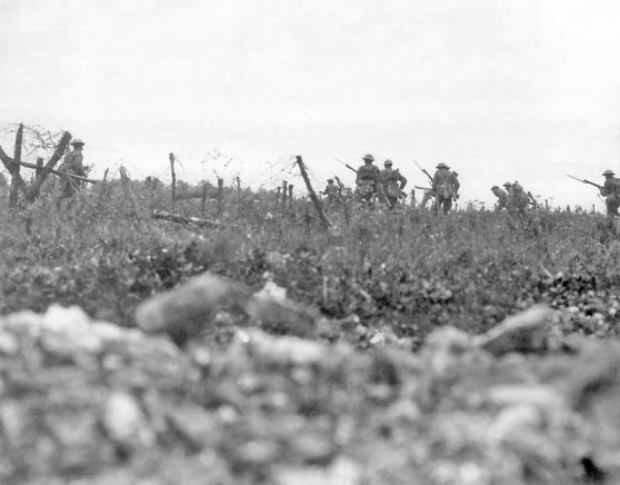
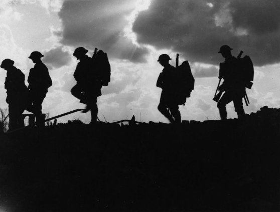
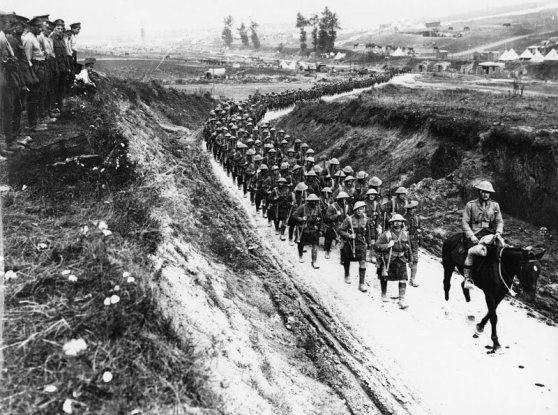
Ernest Brooks
Ernest Brooks was a British photographer, best known for his war photography from the First World War. I have again looked at this artist as he focuses on war. I like how his images are in black and white. The one image I’m really drawn to out of these four images you see below is the image where the shoulders are walking and they seem to be a Silhouette. This image is really strong and I’m instantly drawn to it. The image looks like its been put together using photoshop.
-
- Ernest Brooks
Don McCullin
Don McCullin is a British photojournalist, particularly recognized for his war photography and images of urban strife. He has been shot and badly wounded in Cambodia, imprisoned in Uganda, expelled from Vietnam and had a bounty on his head in Lebanon. He has braved bullets and bombs not only to get the perfect shot but to help dying soldiers and wounded civilians. Compassion is at the heart of all his photography.
I have decided to look at this artist as he focuses on war, which I will also be focusing on for this unit. I also like the how his images are in black and white instead of colour, in my opinion, this really draws the viewer in and makes the images have a rawness, they are more engaging this way and tell more of a story. I also like the use of grain this artist uses.


Don McCullin


Plan
Today we got our brief for our next unit ‘Storytelling’ whilst getting briefed I took down some notes that come to my head when thinking about what to do. I knew before I got the brief that I wanted to use the negatives I got from the battle of Britain film (1969). below are the ideas I came up with.
- storytelling – someone telling a story
- use The Battle of Britain negatives I have
- show the ‘then’ and the ‘now’
- layer the images over the top of each other
- look at war photographers
- look at film/cinema photographers – Cindy Sherman
- liners
- inspired by, or re-interpret an existing story
- think about the what audience….. target audience would be older viewers or people interested in war, or fans of the film
- use film camera maybe Bronica or Mamiya
- battle of Britain memorial Capel
- exhibition or book
look at/research into:
- memorials
- war stories
- patrick keiller – maybe a video?
- war references
- artists that layer images
- battle of Britain memorial Capel-le-ferne
locations from the film:
- Duxford
- Debden
- North Weald
- Hawkinge
- Denton, the Jackdaw inn
- Chilham
- RAF Hawking
Evaluation
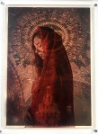
For this project, I wanted to base my idea around religious iconography and how it has changed over the years. I wanted to people look at my work and think about religion and what it means to them. I got my inspiration from visiting Bulgaria where I visited different monasteries and churches. Most of them were covered head to toe in bright colours and various religious icons. I did some further research into artists who worked with religion and religious iconography. Some of these artists include Miles Aldridge, Jean-Paul Gaultier, Pierre et Gilles, and Marco D’Amico (The Way of Bizantinum – Vogue.it).
For this, I then gained an idea of where I wanted to go with my project. I wanted to use the images I got from the Bulgaria of the monasteries. I then wanted to recreate female icons like the artists I researched into, then layer them on top of each other creating a 3D effect. I wanted the golds, and the detail from the pictures of the monasteries to really show through and be as brightly coloured as possible. So that’s where I came to the idea of presenting my images on light boxes, as these will make my pictures pop. I did some research on photographers who used light boxes to display there work and research into making them by hand. I started making than with the help of my boyfriend. I knew I wanted to create three different lightboxes a bit bigger than A4. I wanted three because I came across some research which said icons usually come in threes. And I wanted the light boxes a bit bigger than A4 due to the space I am planning to exhibit my work. Having them any bigger would take up too much off the wall and be too much for the viewer take in.

I then started test shooting in the studio for the female icon. I experimented with different clothing and lighting, once I was happy I then edited my favourite images. I then came to printing my pictures. I knew I need to print on something transparent, so it was either printing onto glass or acetate. I researched into glass, but I was too expensive, and wouldn’t have the same resulted I wanted. So that’s when I tried on acetate. I first tried printing at the printers in the library, the colours came out really well, but the images had roller marks on them from the printers. I tried different printers at uni, but they all had the same problem. I then remembered I had printed on acetate at my old school so contacted them to see if I can use theirs and they kindly said yes.


The images came out exactly how I wanted them, and they looked terrific. I then needed to place the photos on top of the light boxes, I know I wanted quite a thick distance between the background image and the female icon, so I tried with 10mm thick Perspex, and this worked perfectly. Overall I’m so happy with how this project has gone. It’s gone exactly how I wanted it to, and the images look better than I imagined they would. The colours in the pictures are fantastic, and the light boxes, in my opinion, bring it all together.

Final piece presented in Chatham House
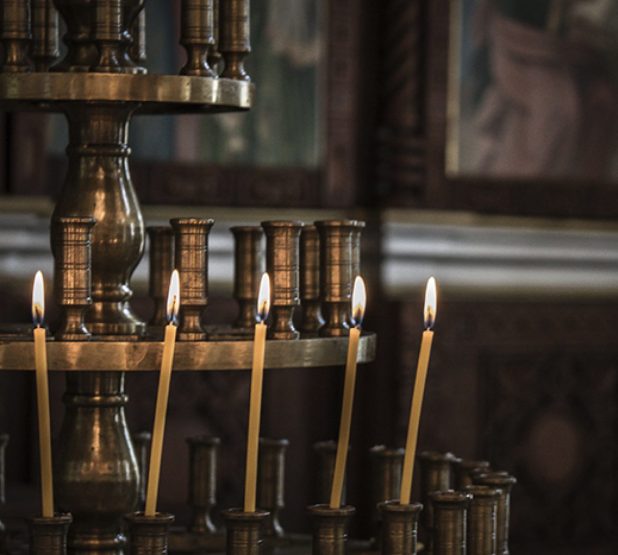
This is how I plan on exhibiting my final piece. There are different layers of my work, which are separated using 10mm thick perspex to create a 3D effect. They will be presented on light-boxes which I made herself. There are three light-boxes all together displaying my work. I also plan to turn the part above the fireplace into a shrine by placing candles on there. Below is a sketch-up and images to show you what my work will look like.

Sketch-up of where I want to exhibit (Chapel – Chatham house)
Here on this page is a sketch-up design of where I want to exhibit, I want to present my work in this particular place as its a chapel and links in with the religious side of my work. I also think my images will look good hanging up in each pillar of the back wall. There are three pillars which is excellent because iconography pictures usually come in threes. I also want to make the fireplace into a shrine with candles. Obviously, for health and safety, they will have to be LED candles.
Below I have added my images to the sketch-up design to show where I want them and how I want the room will look. I think this looks effective and it all seems impressive, I can’t wait to see it will look like when its time to put the show on.
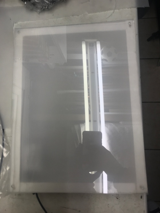
Making the Lightbox
On this page are pictures of the process of making my light-boxes for presenting my work. I started making them by cutting a piece of MDF to an A4 size, I then got a thicker piece of wood and cut that to fit around the A4 bit of MDF, I then secured this together using screws and silicone to make sure it was appropriately secure. I then repeated this step, so I had three outer parts to my light-boxes. Once I completed this stage, I sanded them down and painted them white. I chose to paint them white as reflects light which will make my light-boxes seem brighter. When they were all dry, I then placed led strips to them and drilled two small holes and the bottom of the cable and the sensor for the remote. Once I made sure all the lights were working correctly, I then placed the defuser for the lightbox on top. I made the defuser with tracing paper and frosted polypropylene which I bought from the shop at UCA. I then cut them down to the size I needed. I later purchased some 1mm thick perspex and cut that down to the size I needed. I then placed the tracing paper and frosted polypropylene underneath the perspex and secured this all to the box. We first tried supergluing it down, but that looked messy, so we took it of sanded all down again and painted it then secured them with four little screws in each corner. This suddenly looked so much better. The light-box was then made, and all was left to do was place my images on top of it. To do this, I got a 10mm thick perspex and with superglue stuck my acetate images to either side of it. I then secured them to the light box with superglue just applying it to the corners.
I have a remote that controls the LED lights which lets me also change the colour of them. As you can see from the images below, I have also experimented with the different colours of the LED lights against my pictures. I don’t know what colour I want the lights until they are hanging up in the space.
I am thrilled with how they light-boxes have turned out, and my images look amazing on them. I can’t wait to put them up for the exhibition in January.


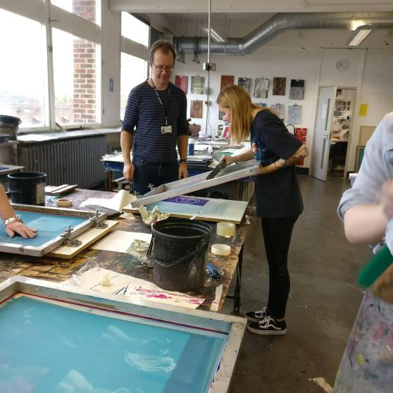
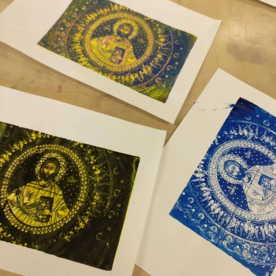
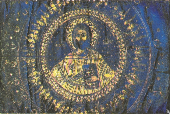
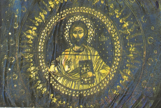
Silkscreen Workshop
In today’s Workshop we was shown how to use the silkscreen process of printing. Before the workshop we had to prepare our image in Photoshop by splitting up the colour layers and printing them onto acetate. Below is the guide we was given to print out our colour Image.
To Print Cyan
Image – Mode – CMYK color (layers now separated)
Select Channels (next to layer in Dialogue box) – Choose Cyan
Image – Mode Bitmap – Discard Channels – Yes
Resolution – Output – 300dpi – Method – Halftone Screen
Frequency – 30 – Lines per inch
Angle – 15
Shape – Ellipse – Ok
File – Print with preview – Registration marks – Print
Edit – Undo – Until full colour image is back.
Now repeat the Process for the other Channels changing the angle for each Channel as follows –
Cyan – 15
Magenta – 45
Yellow – 75
Black – 75
Below are the images of the colours separation printed onto acetate.
-

- Cyan
-

- Magenta
-

- Yellow
-

- Black
After we printed our images onto acetate, they were given to a technician named Simon who turned our images onto stencils for the workshop. Starting with Cyan, we used acrylic paints and a squeegee (the same colour to match each colour layer of the image) and printed our image, layering each different colour layer on top of each other until all the colours worked together to produce an image. My prints can be seen below.


Location Lighting Workshop
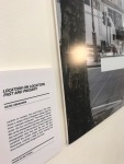
Today we did a location lighting workshop with the new Profoto B2 location kit. This was a fun workshop where we experimented with the equipment inside and outside. It was easy to set up and easy to carry due to it being small and lightweight, some of the photos turned out well, and I have placed them below, I would defiantly think about using this kit on a location set or even buying it myself.

Cyanotype Workshop
Today we had a cyanotype workshop. I had worked with cyanotype before at my previous school, so it was fun to do this technique again. Below are some images from the workshop. As you can see, i tried this three times each time changing the amount of time it was under the UV light or with different paper. As you can tell from the photos, the first one turned out the strongest
As an experiment, i thought I would try to see what my acetate images would look like layered onto of the cyanotype. They look good however the colours of the photos are boring compared to the pictures I intended to use. The images look dull and do not attract the viewer at all. It’s a good idea to keep in my mind for future units.


Collage/Appropriation/Animation Workshop
For this workshop, we worked with Collage/Appropriation/Animation. We went to the library and picked out images we wanted to use to make an animation. For this, i based it on tattoos and tattooed people. I enjoyed this workshop. It was fun and easy to do. I think the video has come out really well. I like it when the figures turn around it looks like they are doing it gradually and it looks natural. the video if this animation is linked below.
Audio Editing Workshop
Here we had an audio editing workshop where we had to place sound over the top of a Video we were given. I had fun doing this and think the sound that I added to the video works well with actions happening in the video. Everything is playing at the right time and sound like part of the video even though it’s not.
Polaroid Workshop
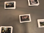
Here we did a workshop using Polaroid’s. For this, we took images on a Polaroid camera. One image black and white the other in colour. We then took these Polaroid’s into the darkroom and cut along the frame of the image, so we were just left with the image. We peeled back to top layer then placed them in boiling water and left it a few minutes till the image started to come away. Once it was separated, it then formed into a delicate fabric. With paint brushes we carefully placed it into cold water onto some acetate and spread it out until the image regained its shape. We then carefully removed it from the water, so the photos didn’t move and left it to dry. We then repeated this the same way with the colour Polaroid image. Below are what the images turned out like, as you can see the black and white images turned out a lot better than the coloured image. This was maybe due to them having different chemicals in them and needed to be in the boiling water for longer. This was an interesting technique that I have learned and did enjoy doing it. However, I didn’t think I will do this method again, as the images didn’t turn out too well.
Combing Images With New Images
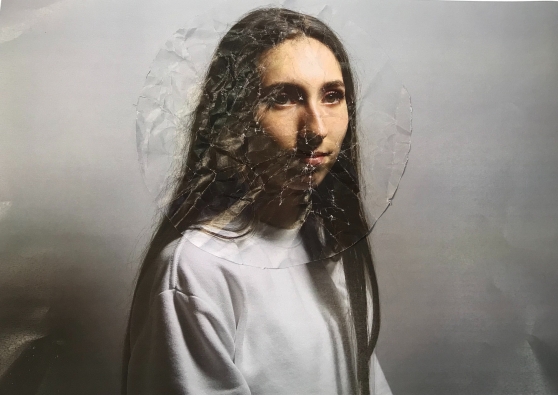
Here I combined the images with the halo with the Bulgaria images. As you can see from the photos below, I have experimented with different backgrounds and model for each picture. Some are stronger than the others, and some don’t work at all. But I’m happy with how they look. I hope they will look even better separated physically.

Combing first edits with Halo
Here I have photoshopped the halo onto the first set of images I did. These photos look so much better, and I am thrilled with how they look now. The halo works well photoshopped in. I look forward to seeing them against the background images.


Second Edits
This is the second lots of edits I have done from the shoots that I did with the halo. The images don’t look too bad. However, I’m still not 100% sure about them I still think the halo seems odd. I believe this is because it doesn’t go round the models whole head. I took a picture of the halo separately. I plan to photoshop the halo on to the first set of edited images I did and see if it looks better then.


Test Shoot 7
For this shoot, I have done the same as shoot six. However, this time changing the clothing. This shoot is better than the previous one. However, I still don’t think it looks right..

Test Shoot 6 – With Crown
For this shoot, I have done the same as my first shoot but this time experiment with adding a halo to the shoot. As you can see I have experimented with it in deferent ways with the silver dress, I did this by placing the halo on its own with the dress, then with some flower. Then with the red headscarf and then finally with the halo, Flowers and head scarf altogether. I also experiment with the different lighting as I did in the last two shoots. I don’t like how this shoot went. The objects I placed in the shoot didn’t go together as well as I thought they would. Something doesn’t look right. In my next shoot, I will maybe try with different clothing.
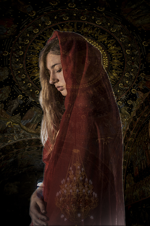
Combing Images
Here I have combined the images from the studio with the pictures from Bulgaria. I like how these look. And think they will look more efficient once separated physically and presented on a lightbox. The images work well together and compliment each other effectively. The colours are bright and eye-catching witch I want.
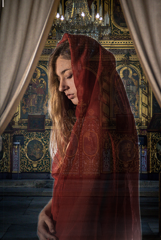


Edits so far
The images you see on this page are some edits I have done with the photos I have taken so far. I am really pleased with how these have turned out and think they will look effective against the busy backgrounds I plan to place behind them. I think the colours I have chosen will look really well against the gold that is in the other photos.


Test shoot 5
For this shoot, I used the same lighting that I used in shoot four, however, this time I changed the clothing to the flower patterned playsuit with the chest cut out, as you can see I paired this with the red headscarf. I like the colours of this shoot. They are really bright and work well together. The red headscarf makes red flowers in the playsuit really stand out. I’m pleased with how this shoot has turned out.
Test Shoot 4
For this shoot, I used the red dress with the red headscarf, but this time I experimented with different lighting. I did this by only using one light instead of two. For this, I just removed the light that had the softbox on it and used the side lightly with the defuser. I like how these images have turned out. However, some of them are a bit too dark on the face. This could maybe be brightened up in Photoshop/Lightroom.
Test Shoot 3
For this third shoot, I have again used the same lighting. However, this time experimented with different clothing. For this, I combined the clothing from the first shoot by choosing an outfit that had a flower print on it. I then connected it with the second shoot by making it sexy by having the front of the top cut away, so her chest was showing making it modern and sexy still. I like this choice of clothing think it works well with the headscarf. I experimented again with the blue and red headscarf and concluded the red one was the best in this shoot. Some of these images are strong. However, for my next shoot, I will experiment with different lighting, maybe making it darker, perhaps having some shadows across the face.
Test Shoot 2
This is the second shoot I have done, as you can tell I have used the same lighting but this time I have experimented with different clothes. I have this time put the model in an off-the-shoulder red dress. I chose this as I wanted the model to look more modern and sexy compared the clothing on the original icon paintings. I first placed the dress with a red scarf with gold detail in it. Even though there is a lot of red in these images, I think this works well together, especially when it will have the busy background behind it. I then tested it with a blue scarf. However, I didn’t like how this went together.
I still think I need to experiment with different clothing so this time I will try something combining this shoot and the first soot.
Test shoot 1
This is the first test shoot I did in the studio. For this shoot, I used the Canon 5D with a white backdrop as I’m planning to crop it out anyway. I used two spotlights one with a softbox and one with a defuser in front of it. There are two images at the bottom of this page to show how I set the studio up.
I decided to put the model in a silver shiny flower print dress. For the first couple of shots, I chose to pair it with a red scarf on the head. I then experiment using a blue scarf. As you can see from my images, I also experimented in different ways in which I placed the headscarf. I wanted the model to be wearing minimal makeup, but her lips to look shiny, so for this I used Vaseline. I also slightly wet the hair, so it came out more detailed in the photos. For the first shoot, I think this went quite efficiently. However, I’m not too sure on the dress with he headscarf so for my next shoot I plan to try different clothing. Out of the red and the blue scarf, I think the red one looks the most effective.
Bachkovo Monastery
Bachkovo Monastery (“Assumption of the Holy Mother”) is my favorite Monastery I went to in Bulgaria. The artwork in there was incredible, covered head to toe in icons and gold, and you can see this from my images below. Bachkovo monastery is the second largest monastery in Bulgaria. The famous Bulgarian icon painter Zahariy Zograf (1810-1853), executed the images in the church’s interior from 1838-1840. In the cathedral, there is an icon from 1311 known as The Holy Mother of God Icon, with a silver repousse cover. This figure is believed to have miraculous powers, and It attracts many visitors. People can queue and go to pray, share their worries; ask for protection and well-being in life.
Asen’s Fortress
These images you see are of the church built next to the Asen’s fortress. Asen’s fortress has existed since the times of the Thracians /3rd millennium BC. It was enlarged and fortified in 1231 during the reign of Tsar Ivan Asen II, and it was named after him. It was conquered by the crusaders during the Third Crusade, and it was destroyed to a great extent during the fall of Bulgaria under the Turkish yoke. “The Holy Mother from Petrich” church is the sole completely preserved building and are the images you see below. The frescoes you see in my pictures go backdating to the 13th century. The church is one of the oldest in all of Eastern Orthodoxy. The church was restored as you can also see from my photos, but where the fresco paintings are so old, they couldn’t repair all of them.
Uzundzhovo Church
On this page are some images of a different Russian church in Bulgaria called Uzundzhovo church (Church of the Assumption). This was another fantastic church with so much history too it. It is a Bulgarian Orthodox church in the village of Uzundzhovo, Haskovo. It was Built as a mosque during the Ottoman era, and it was reconstructed in 1906 as a church. It has various elements of Christianity and Islam. You can see from my images that this church looks newly built, the reason why it does is that in 2007 the church was thoroughly reconstructed by the Haskovo Municipality. During the restoration works, two medieval inscriptions in Arabic on religious-philosophical topics were discovered. All the icons and frescoes were restored.
Shipka Monastery
On this page are some images I took in Shipka Monastery in Bulgaria. This Monastery was beautiful inside and out, and you can see how much effort was put into this church. Every detail was thought about carefully. Shipka Monastery is a Bulgarian Orthodox church built near the town of Shipka. This monastery was dedicated to the Russian and Bulgarian soldiers that died for the liberation of Bulgaria in the Russo-Turkish War, 1877-78. The churches have a bell tower and are one the heaviest of which it weighs 12 tons. It was cast from the cartridges that were collected after the battles of the Russo-Turkish War. From some of my image you can see that in the temple itself, the names of the Russian regiments and Bulgarian volunteers are inscribed on 34 marble plates.
Gustav Klimt
Gustav Klimt was an Austrian Symbolist painter and one of the most prominent members of the Vienna Art Nouveau (Vienna Secession) movement. Klimt’s ‘Golden Phase’ was a success, and is the main reason I have looked at this artist. When he did these paintings, he utilized gold leaf in his work. This was a technique that icon painters also used in their work when painting in Monasteries. Below are some examples of his work.
Andres Serrano
Andres Serrano has never called himself a photographer. He studied painting and sculpture and sees himself as an artist with a camera. He learned everything he knows about art from Marcel Duchamp. I have looked at this artist as his photos link in with my project with religion. Serrano’s images are amazing they are bright and eye-catching. His pictures are unique and bold. Below are some photos of his work.
Icons
- it was icons of the mother of God with the Christ-child to which the healing of the blind and the lame, the possessed and the feverish was attributed, along with the liberation of the whole regions from epidemics. They were also created with bringing victory over enemy armies and raising sieges.
- Christians began to use symbols to decorate objects: a dove, for example.
- what is an icon? Worldwide, celebrities from the worlds of sport and popular culture are described as such, and the word turns up everywhere in computer-speak.
- the icon as the hallmark of Orthodox piety.
- human nature, to possess pictures of people dear to them.
- the image issue was altogether existential importance for Christian theology.
- Christ, if he is recognized as consubstantial with the other, was the image of God in human form, and that his human nature could thus be depicted in images.
- the images of Christ and the saints may and should be venerated, with kisses, candles, incense, song etc., but they must not be worshipped, for worship is due to god alone.
- the necessity that the imagery of icons is understood everywhere and by all believers, was not without consequences of the form and content of the artistic depiction.
- the likeness between image and prototype as demanded by the church meant that icon-painters were not allowed to paint the sacred persons and biblical scenes freely according to their imaginations, but had to keep to traditional archetypes.
- the icon does not show a detail of the earthly world but points to a supernatural and eternal reality. for this reason, the painters had to avoid anything that could evoke the impression of spatiality, plasticity or a particular time.
- the sacred figures are depicted in representative attitudes, most often in frontal or axial view, in order to create the direct relationship between picture and beholder.
- the usual Russian domestic icon measures 31 x 26 cm.
Early Medieval Art
- Colours were not chosen for such purely aesthetic reasons as “beauty” or “value”, but because they carried significant meanings.
- The basis of the symbolism was the number four, the old Babylonian number signifying the cosmos. to the four beings, who were regarded as the visible manifestations of God, could be symbolically juxtaposed concepts with a single significance that yet were fourfold.
- Irenaeus for instance, mentioned the four corners of the earth and the four winds, compared the four pillars of the world with the four pillars of the church, and claimed that the four who stood beside God’s throne, in the form of a man, a lion, an ox, and an eagle, was the embodiment of the Logos (word of god).
- frescoes show miracles performed by Christ and are painted in a large format, in epic style.
- it was not until the Ottonian period, about the same time the St.George frescoes were made, that illuminated manuscripts began to include the stories of miracles and other narrative scenes from the Gospels.
- Fresco painters were travellers who carried out a job and went on their way.
- works in gold were very important in the Ottonian era; they became far more numerous, and most of the important artifacts were glided.
- although gold, glided, gold covered, and gold-framed articles were frequently produced, and although gold had an extensive range of meanings, the importance given to the material seems to stand in inverse relation to the artistic ability and profundity of thought expended in working it.
Light box Ideas
On this page, I have looked at other artists that have used light boxes as a way of displaying their work. I have looked at this as I plan to present my work like this when it is completed.

Unknown Artist

Marlon Dalto

MILLIE WILSON
Miles Aldridge
Born in London in 1964, Miles Aldridge has published his photographs in such influential magazines as Vogue Italia, American Vogue, Numéro, The New York Times, The New Yorker, and Paradis. I like the halos he adds in his images, they make the models look important and make the pictures stand out. The use of the vail in his pictures makes the model look religious. Below are some images of his. This artist has inspired me, and what to incorporate some of his work into mine.
The Ten Commandments Movie
Here I have looked at the movie The Ten Commandments, I have looked at this movie due to the lighting they use and the make-up and styling. I really like the lighting in this film, I like how there is a lot of contrast, and the gold in the costumes show through. The makeup is another thing I love it’s simple but still flattering. Below I have added some images and videos from the movie.
Working with paper & negative surfaces in the darkroom
For this workshop, we went into the darkroom and experimented in different ways of folding or scrunch up the photo paper before we exposed the negative to the paper. This then distorted the image as parts of the paper was exposed, and some were not. You can see different ways below of how I experimented with this.
Jean-Paul Gaultier
Here I have looked at an artist/fashion designer called Jean-Paul Gaultier. Gaultier is a French designer, best known for his eponymous design house and his seven-year tenure as head designer at Hermès. I found this artist looking through one of his books with all his work in. I have placed images of this book and some of the pages below.
As my work on this unit is based around religious iconography I was really drawn to his work he did in Spring-Summer 2007 Couture fashion show. Every model wore a halo in the show start till finish. Their faces were painted like plaster statues, their garb inspired by the vernacular devotional art found in local churches throughout the Catholic world. Below are some pictures from the show. I looked at this work to get ideas on make-up and costume for the shoot I plan to do with a model.
https://www.vogue.com/fashion-shows/spring-2007-couture/jean-paul-gaultier

Collage Workshop
For this workshop, we had to gather images and combine them together making a collage. For this workshop, I used images from my Bulgaria trip. Below is an image of the outcome, overall I’m quite happy with how this has turned out. It looks effective, and the images work really well together.

Pierre et Gilles
Pierre et Gilles are two French artists who collaborate on hand-painted photographs. Pierre Commoy, born 1950, and his romantic partner, Gilles Blanchard, born 1953. Pierre is the main man behind the camera and he adds his unique aesthetic adornments that frame each shot. Specializing in portraits of celebrities like Madonna and Boy George, as well as fashion models. The duo creates images that mix reality, daily life, dreams, and fantasies. The two obviously think carefully about their shoot and plan them out thoroughly, the colours they use in their images always clash nicely together. They use bright colours and their images are always busy to draw the viewers in, this is the main thing I like about their work. Below are a few of their images.
