Evaluation

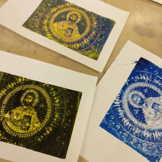
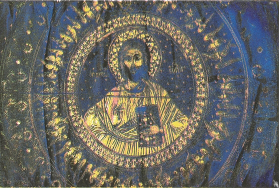
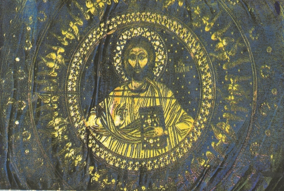
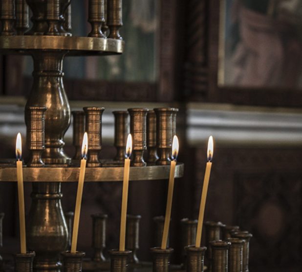
For this project, I wanted to base my idea around religious iconography and how it has changed over the years. I wanted to people look at my work and think about religion and what it means to them. I got my inspiration from visiting Bulgaria where I visited different monasteries and churches. Most of them were covered head to toe in bright colours and various religious icons. I did some further research into artists who worked with religion and religious iconography. Some of these artists include Miles Aldridge, Jean-Paul Gaultier, Pierre et Gilles, and Marco D’Amico (The Way of Bizantinum – Vogue.it).

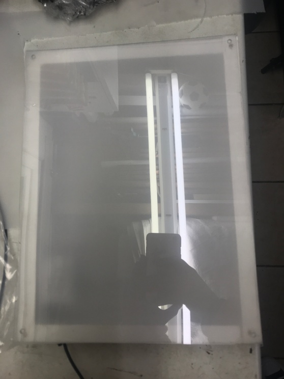
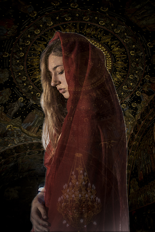
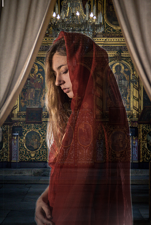
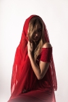
 For this, I then gained an idea of where I wanted to go with my project. I wanted to use the images I got from the Bulgaria of the monasteries. I then wanted to recreate female icons like the artists I researched into, then layer them on top of each other creating a 3D effect. I wanted the golds, and the detail from the pictures of the monasteries to really show through and be as brightly coloured as possible. So that’s where I came to the idea of presenting my images on light boxes, as these will make my pictures pop. I did some research on photographers who used light boxes to display there work and research into making them by hand. I started making than with the help of my boyfriend. I knew I wanted to create three different lightboxes a bit bigger than A4. I wanted three because I came across some research which said icons usually come in threes. And I wanted the light boxes a bit bigger than A4 due to the space I am planning to exhibit my work. Having them any bigger would take up too much off the wall and be too much for the viewer take in.

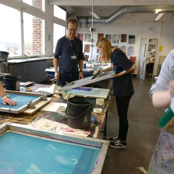
I then started test shooting in the studio for the female icon. I experimented with different clothing and lighting, once I was happy I then edited my favourite images. I then came to printing my pictures. I knew I need to print on something transparent, so it was either printing onto glass or acetate. I researched into glass, but I was too expensive, and wouldn’t have the same resulted I wanted. So that’s when I tried on acetate. I first tried printing at the printers in the library, the colours came out really well, but the images had roller marks on them from the printers. I tried different printers at uni, but they all had the same problem. I then remembered I had printed on acetate at my old school so contacted them to see if I can use theirs and they kindly said yes.

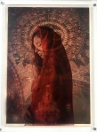
The images came out exactly how I wanted them, and they looked terrific. I then needed to place the photos on top of the light boxes, I know I wanted quite a thick distance between the background image and the female icon, so I tried with 10mm thick Perspex, and this worked perfectly. Overall I’m so happy with how this project has gone. It’s gone exactly how I wanted it to, and the images look better than I imagined they would. The colours in the pictures are fantastic, and the light boxes, in my opinion, bring it all together.


Final piece presented in Chatham House

This is how I plan on exhibiting my final piece. There are different layers of my work, which are separated using 10mm thick perspex to create a 3D effect. They will be presented on light-boxes which I made herself. There are three light-boxes all together displaying my work. I also plan to turn the part above the fireplace into a shrine by placing candles on there. Below is a sketch-up and images to show you what my work will look like.


Sketch-up of where I want to exhibit (Chapel – Chatham house)

Here on this page is a sketch-up design of where I want to exhibit, I want to present my work in this particular place as its a chapel and links in with the religious side of my work. I also think my images will look good hanging up in each pillar of the back wall. There are three pillars which is excellent because iconography pictures usually come in threes.  I also want to make the fireplace into a shrine with candles. Obviously, for health and safety, they will have to be LED candles.

Below I have added my images to the sketch-up design to show where I want them and how I want the room will look. I think this looks effective and it all seems impressive, I can’t wait to see it will look like when its time to put the show on.


Making the Lightbox

On this page are pictures of the process of making my light-boxes for presenting my work. I  started making them by cutting a piece of MDF to an A4 size, I then got a thicker piece of wood and cut that to fit around the A4 bit of MDF, I then secured this together using screws and silicone to make sure it was appropriately secure. I then repeated this step, so I had three outer parts to my light-boxes. Once I completed this stage, I sanded them down and painted them white. I chose to paint them white as reflects light which will make my light-boxes seem brighter. When they were all dry, I then placed led strips to them and drilled two small holes and the bottom of the cable and the sensor for the remote. Once I made sure all the lights were working correctly, I then placed the defuser for the lightbox on top. I made the defuser with tracing paper and frosted polypropylene which I bought from the shop at UCA. I then cut them down to the size I needed. I later purchased some 1mm thick perspex and cut that down to the size I needed. I then placed the tracing paper and frosted polypropylene underneath the perspex and secured this all to the box. We first tried supergluing it down, but that looked messy, so we took it of sanded all down again and painted it then secured them with four little screws in each corner. This suddenly looked so much better. The light-box was then made, and all was left to do was place my images on top of it. To do this, I got a 10mm thick perspex and with superglue stuck my acetate images to either side of it. I then secured them to the light box with superglue just applying it to the corners.

I have a remote that controls the LED lights which lets me also change the colour of them. As you can see from the images below, I have also experimented with the different colours of the LED lights against my pictures. I don’t know what colour I want the lights until they are hanging up in the space.

I am thrilled with how they light-boxes have turned out, and my images look amazing on them. I can’t wait to put them up for the exhibition in January.


Silkscreen Workshop

In today’s Workshop we was shown how to use the silkscreen process of printing. Before the workshop we had to prepare our image in Photoshop by splitting up the colour layers and printing them onto acetate. Below is the guide we was given to print out our colour Image.

To Print Cyan

Image – Mode – CMYK color (layers now separated)

Select Channels (next to layer in Dialogue box) – Choose Cyan

Image – Mode Bitmap – Discard Channels – Yes

Resolution – Output – 300dpi – Method – Halftone Screen

Frequency – 30 – Lines per inch

Angle – 15

Shape – Ellipse – Ok

File – Print with preview – Registration marks – Print

Edit – Undo – Until full colour image is back.

Now repeat the Process for the other Channels changing the angle for each Channel as follows –

Cyan – 15

Magenta – 45

Yellow – 75

Black – 75

Below are the images of the colours separation printed onto acetate.

After we printed our images onto acetate, they were given to a technician named Simon who turned our images onto stencils for the workshop. Starting with Cyan, we used acrylic paints and a squeegee (the same colour to match each colour layer of the image) and printed our image, layering each different colour layer on top of each other until all the colours worked together to produce an image. My prints can be seen below.


Location Lighting Workshop

Today we did a location lighting workshop with the new Profoto B2 location kit. This was a fun workshop where we experimented with the equipment inside and outside. It was easy to set up and easy to carry due to it being small and lightweight, some of the photos turned out well, and I have placed them below, I would defiantly think about using this kit on a location set or even buying it myself.

profoto-b2-location-kit-3-1024x529

Cyanotype Workshop

Today we had a cyanotype workshop. I had worked with cyanotype before at my previous school, so it was fun to do this technique again.  Below are some images from the workshop. As you can see, i tried this three times each time changing the amount of time it was under the UV light or with different paper. As you can tell from the photos, the first one turned out the strongest

As an experiment, i thought I would try to see what my acetate images would look like layered onto of the cyanotype. They look good however the colours of the photos are boring compared to the pictures I intended to use. The images look dull and do not attract the viewer at all. It’s a good idea to keep in my mind for future units.


Collage/Appropriation/Animation Workshop

For this workshop, we worked with Collage/Appropriation/Animation. We went to the library and picked out images we wanted to use to make an animation. For this, i based it on tattoos and tattooed people. I enjoyed this workshop. It was fun and easy to do. I think the video has come out really well. I like it when the figures turn around it looks like they are doing it gradually and it looks natural.  the video if this animation is linked below.


Audio Editing Workshop

Here we had an audio editing workshop where we had to place sound over the top of a Video we were given. I had fun doing this and think the sound that I added to the video works well with actions happening in the video. Everything is playing at the right time and sound like part of the video even though it’s not.

Polaroid Workshop

Here we did a workshop using Polaroid’s. For this, we took images on a Polaroid camera. One image black and white the other in colour. We then took these Polaroid’s into the darkroom and cut along the frame of the image, so we were just left with the image. We peeled back to top layer then placed them in boiling water and left it a few minutes till the image started to come away. Once it was separated, it then formed into a delicate fabric. With paint brushes we carefully placed it into cold water onto some acetate and spread it out until the image regained its shape. We then carefully removed it from the water, so the photos didn’t move and left it to dry. We then repeated this the same way with the colour Polaroid image. Below are what the images turned out like, as you can see the black and white images turned out a lot better than the coloured image. This was maybe due to them having different chemicals in them and needed to be in the boiling water for longer. This was an interesting technique that I have learned and did enjoy doing it. However, I didn’t think I will do this method again, as the images didn’t turn out too well.

Combing Images With New Images

Here I combined the images with the halo with the Bulgaria images. As you can see from the photos below, I have experimented with different backgrounds and model for each picture. Some are stronger than the others, and some don’t work at all. But I’m happy with how they look. I hope they will look even better separated physically.

Combing first edits with Halo

Here I have photoshopped the halo onto the first set of images I did. These photos look so much better, and I am thrilled with how they look now. The halo works well photoshopped in. I look forward to seeing them against the background images.

Second Edits

This is the second lots of edits I have done from the shoots that I did with the halo. The images don’t look too bad. However, I’m still not 100% sure about them I still think the halo seems odd. I believe this is because it doesn’t go round the models whole head. I took a picture of the halo separately. I plan to photoshop the halo on to the first set of edited images I did and see if it looks better then.

holly shoot 2 25th0137

Test Shoot 7

For this shoot, I have done the same as shoot six. However, this time changing the clothing. This shoot is better than the previous one. However, I still don’t think it looks right..

Test Shoot 6 – With Crown

For this shoot, I have done the same as my first shoot but this time experiment with adding a halo to the shoot. As you can see I have experimented with it in deferent ways with the silver dress, I did this by placing the halo on its own with the dress, then with some flower. Then with the red headscarf and then finally with the halo, Flowers and head scarf altogether. I also experiment with the different lighting as I did in the last two shoots. I don’t like how this shoot went. The objects I placed in the shoot didn’t go together as well as I thought they would. Something doesn’t look right. In my next shoot, I will maybe try with different clothing.

Combing Images

Here I have combined the images from the studio with the pictures from Bulgaria. I like how these look. And think they will look more efficient once separated physically and presented on a lightbox. The images work well together and compliment each other effectively. The colours are bright and eye-catching witch I want.

Edits so far

The images you see on this page are some edits I have done with the photos I have taken so far. I am really pleased with how these have turned out and think they will look effective against the busy backgrounds I plan to place behind them. I think the colours I have chosen will look really well against the gold that is in the other photos.

Test shoot 5

For this shoot, I used the same lighting that I used in shoot four, however, this time I changed the clothing to the flower patterned playsuit with the chest cut out, as you can see I paired this with the red headscarf. I like the colours of this shoot. They are really bright and work well together. The red headscarf makes red flowers in the playsuit really stand out. I’m pleased with how this shoot has turned out.

Test Shoot 4

For this shoot, I used the red dress with the red headscarf, but this time I experimented with different lighting. I did this by only using one light instead of two. For this, I just removed the light that had the softbox on it and used the side lightly with the defuser. I like how these images have turned out. However, some of them are a bit too dark on the face. This could maybe be brightened up in Photoshop/Lightroom.

Test Shoot 3

For this third shoot, I have again used the same lighting. However, this time experimented with different clothing. For this, I combined the clothing from the first shoot by choosing an outfit that had a flower print on it. I then connected it with the second shoot by making it sexy by having the front of the top cut away, so her chest was showing making it modern and sexy still. I like this choice of clothing think it works well with the headscarf. I experimented again with the blue and red headscarf and concluded the red one was the best in this shoot. Some of these images are strong. However, for my next shoot, I will experiment with different lighting, maybe making it darker, perhaps having some shadows across the face.


Test Shoot 2

This is the second shoot I have done, as you can tell I have used the same lighting but this time I have experimented with different clothes. I have this time put the model in an off-the-shoulder red dress. I chose this as I wanted the model to look more modern and sexy compared the clothing on the original icon paintings. I first placed the dress with a red scarf with gold detail in it. Even though there is a lot of red in these images, I think this works well together, especially when it will have the busy background behind it. I then tested it with a blue scarf. However, I didn’t like how this went together.

I still think I need to experiment with different clothing so this time I will try something combining this shoot and the first soot.

Test shoot 1

This is the first test shoot I did in the studio. For this shoot, I used the Canon 5D with a white backdrop as I’m planning to crop it out anyway. I used two spotlights one with a softbox and one with a defuser in front of it. There are two images at the bottom of this page to show how I set the studio up.

I decided to put the model in a silver shiny flower print dress. For the first couple of shots, I chose to pair it with a red scarf on the head. I then experiment using a blue scarf. As you can see from my images, I also experimented in different ways in which I placed the headscarf. I wanted the model to be wearing minimal makeup, but her lips to look shiny, so for this I used Vaseline. I also slightly wet the hair, so it came out more detailed in the photos. For the first shoot, I think this went quite efficiently. However, I’m not too sure on the dress with he headscarf so for my next shoot I plan to try different clothing. Out of the red and the blue scarf, I think the red one looks the most effective.


Bachkovo Monastery

Bachkovo Monastery (“Assumption of the Holy Mother”) is my favorite Monastery I went to in Bulgaria. The artwork in there was incredible, covered head to toe in icons and gold, and you can see this from my images below.  Bachkovo monastery is the second largest monastery in Bulgaria. The famous Bulgarian icon painter Zahariy Zograf (1810-1853), executed the images in the church’s interior from 1838-1840. In the cathedral, there is an icon from 1311 known as The Holy Mother of God Icon, with a silver repousse cover. This figure is believed to have miraculous powers, and It attracts many visitors. People can queue and go to pray, share their worries; ask for protection and well-being in life.

Asen’s Fortress

These images you see are of the church built next to the Asen’s fortress. Asen’s fortress has existed since the times of the Thracians /3rd millennium BC. It was enlarged and fortified in 1231 during the reign of Tsar Ivan Asen II, and it was named after him. It was conquered by the crusaders during the Third Crusade, and it was destroyed to a great extent during the fall of Bulgaria under the Turkish yoke. “The Holy Mother from Petrich” church is the sole completely preserved building and are the images you see below. The frescoes you see in my pictures go backdating to the 13th century. The church is one of the oldest in all of Eastern Orthodoxy. The church was restored as you can also see from my photos, but where the fresco paintings are so old, they couldn’t repair all of them.

Uzundzhovo Church

On this page are some images of a different Russian church in Bulgaria called Uzundzhovo church (Church of the Assumption). This was another fantastic church with so much history too it. It is a Bulgarian Orthodox church in the village of Uzundzhovo, Haskovo. It was Built as a mosque during the Ottoman era, and it was reconstructed in 1906 as a church. It has various elements of Christianity and Islam. You can see from my images that this church looks newly built, the reason why it does is that in 2007 the church was thoroughly reconstructed by the Haskovo Municipality. During the restoration works, two medieval inscriptions in Arabic on religious-philosophical topics were discovered. All the icons and frescoes were restored.

Shipka Monastery

On this page are some images I took in Shipka Monastery in Bulgaria. This Monastery was beautiful inside and out, and you can see how much effort was put into this church. Every detail was thought about carefully.  Shipka Monastery is a Bulgarian Orthodox church built near the town of Shipka. This monastery was dedicated to the Russian and Bulgarian soldiers that died for the liberation of Bulgaria in the Russo-Turkish War, 1877-78. The churches have a bell tower and are one the heaviest of which it weighs 12 tons. It was cast from the cartridges that were collected after the battles of the Russo-Turkish War. From some of my image you can see that in the temple itself, the names of the Russian regiments and Bulgarian volunteers are inscribed on 34 marble plates.

Gustav Klimt

Gustav Klimt was an Austrian Symbolist painter and one of the most prominent members of the Vienna Art Nouveau (Vienna Secession) movement. Klimt’s ‘Golden Phase’ was a success, and is the main reason I have looked at this artist. When he did these paintings, he utilized gold leaf in his work. This was a technique that icon painters also used in their work when painting in Monasteries. Below are some examples of his work.

Andres Serrano

Andres Serrano has never called himself a photographer. He studied painting and sculpture and sees himself as an artist with a camera. He learned everything he knows about art from Marcel Duchamp. I have looked at this artist as his photos link in with my project with religion. Serrano’s images are amazing they are bright and eye-catching. His pictures are unique and bold. Below are some photos of his work.

Icons

  • it was icons of the mother of God with the Christ-child to which the healing of the blind and the lame, the possessed and the feverish was attributed, along with the liberation of the whole regions from epidemics. They were also created with bringing victory over enemy armies and raising sieges.
  • Christians began to use symbols to decorate objects: a dove, for example.
  • what is an icon? Worldwide, celebrities from the worlds of sport and popular culture are described as such, and the word turns up everywhere in computer-speak.
  • the icon as the hallmark of Orthodox piety.
  • human nature, to possess pictures of people dear to them.
  • the image issue was altogether existential importance for Christian theology.
  • Christ, if he is recognized as consubstantial with the other, was the image of God in human form, and that his human nature could thus be depicted in images.
  • the images of Christ and the saints may and should be venerated, with kisses, candles, incense, song etc., but they must not be worshipped, for worship is due to god alone.
  • the necessity that the imagery of icons is understood everywhere and by all believers, was not without consequences of the form and content of the artistic depiction.
  • the likeness between image and prototype as demanded by the church meant that icon-painters were not allowed to paint the sacred persons and biblical scenes freely according to their imaginations, but had to keep to traditional archetypes.
  • the icon does not show a detail of the earthly world but points to a supernatural and eternal reality. for this reason, the painters had to avoid anything that could evoke the impression of spatiality, plasticity or a particular time.
  • the sacred figures are depicted in representative attitudes, most often in frontal or axial view, in order to create the direct relationship between picture and beholder.
  • the usual Russian domestic icon measures 31 x 26 cm.

Early Medieval Art

  • Colours were not chosen for such purely aesthetic reasons as “beauty” or “value”, but because they carried significant meanings.
  •  The basis of the symbolism was the number four, the old Babylonian number signifying the cosmos. to the four beings, who were regarded as the visible manifestations of God, could be symbolically juxtaposed concepts with a single significance that yet were fourfold.
  • Irenaeus for instance, mentioned the four corners of the earth and the four winds, compared the four pillars of the world with the four pillars of the church, and claimed that the four who stood beside God’s throne, in the form of a man, a lion, an ox, and an eagle, was the embodiment of the Logos (word of god).
  • frescoes show miracles performed by Christ and are painted in a large format, in epic style.
  • it was not until the Ottonian period, about the same time the St.George frescoes were made, that illuminated manuscripts began to include the stories of miracles and other narrative scenes from the Gospels.
  • Fresco painters were travellers who carried out a job and went on their way.
  • works in gold were very important in the Ottonian era; they became far more numerous, and most of the important artifacts were glided.
  • although gold, glided, gold covered, and gold-framed articles were frequently produced, and although gold had an extensive range of meanings, the importance given to the material seems to stand in inverse relation to the artistic ability and profundity of thought expended in working it.

Light box Ideas

On this page, I have looked at other artists that have used light boxes as a way of displaying their work. I have looked at this as I plan to present my work like this when it is completed.

sunshine_feat5_1

Unknown Artist


marlon-dalton

Marlon Dalto


4.boys.and.men.instal_edited-1.web

MILLIE WILSON

Miles Aldridge

Born in London in 1964, Miles Aldridge has published his photographs in such influential magazines as Vogue Italia, American Vogue, Numéro, The New York Times, The New Yorker, and Paradis. I like the halos he adds in his images, they make the models look important and make the pictures stand out. The use of the vail in his pictures makes the model look religious. Below are some images of his. This artist has inspired me, and what to incorporate some of his work into mine.

The Ten Commandments Movie

Here I have looked at the movie The Ten Commandments, I have looked at this movie due to the lighting they use and the make-up and styling. I really like the lighting in this film, I like how there is a lot of contrast, and the gold in the costumes show through. The makeup is another thing I love it’s simple but still flattering. Below I have added some images and videos from the movie.

Jean-Paul Gaultier

Here I have looked at an artist/fashion designer called Jean-Paul Gaultier. Gaultier is a French designer, best known for his eponymous design house and his seven-year tenure as head designer at Hermès. I found this artist looking through one of his books with all his work in. I have placed images of this book and some of the pages below.


As my work on this unit is based around religious iconography I was really drawn to his work he did in Spring-Summer 2007 Couture fashion show. Every model wore a halo in the show start till finish. Their faces were painted like plaster statues, their garb inspired by the vernacular devotional art found in local churches throughout the Catholic world. Below are some pictures from the show. I looked at this work to get ideas on make-up and costume for the shoot I plan to do with a model.

https://www.vogue.com/fashion-shows/spring-2007-couture/jean-paul-gaultier

Collage Workshop

For this workshop, we had to gather images and combine them together making a collage. For this workshop, I used images from my Bulgaria trip. Below is an image of the outcome, overall I’m quite happy with how this has turned out. It looks effective, and the images work really well together.


img_6034.jpg

Pierre et Gilles

Pierre et Gilles are two French artists who collaborate on hand-painted photographs. Pierre Commoy, born 1950, and his romantic partner, Gilles Blanchard, born 1953. Pierre is the main man behind the camera and he adds his unique aesthetic adornments that frame each shot. Specializing in portraits of celebrities like Madonna and Boy George, as well as fashion models. The duo creates images that mix reality, daily life, dreams, and fantasies. The two obviously think carefully about their shoot and plan them out thoroughly, the colours they use in their images always clash nicely together. They use bright colours and their images are always busy to draw the viewers in, this is the main thing I like about their work. Below are a few of their images.

The Way of Bizantinum – Vogue.it

This is some research I found on religious iconography. I found this research from Vogue Italia. I liked this work because of it is simple but still effective. I like how they have kept the clothes modern but added in small religious elements to the image. The Images are recalling a historic past; revisited, reinterpreted. From photography to styling. The photographer is Marco D’Amico, Marco Grisolia is the stylist and visionary designer, Romina Toscano is the fashion editor. The styling features layers, dark yet shiny shades, embellished with accessories that recall the iconography. The symbols behind the model bring out the image and clash effectively with the colours of the clothes.

http://www.marcodamico.net/the-way-of-bizantinum-vogue-it

Marco D’Amico, born in 1977, is a fashion photographer and filmmaker. He graduated in Sociology and developed his passion for photography after finishing his studies, becoming a self-taught photographer. In his Personal work, he also has a lot of religious images. I have added the link and some of these images below.

http://www.marcodamico.net/personal

Liquid Light Workshop

For this workshop, we learned how to use liquid light. As we are using chemicals, we need safety gear. This includes of rubber gloves, apron, and goggles. The Equipment required is developing trays, tongs, nonmetallic brushes, kettle, hairdryer, material to coat, coating area, timer, enlarger or UV bed – negative or acetate, varnish, metal jar or appropriate container to heat liquid light emulsion, thermometer.
preparation for liquid light
Prepare an easel to the size you wish to print. pre-cut your coating material. Set up your enlarger with selected negative. Put on your safety equipment. Mix up the paper developer and fix in the dev trays. Prepare a drying area. Layout equipment for coating the material.
Once you expose your negative to the liquid light, you will need to place it in the developer tray and agitate for 2.5 minutes – no longer. Then put it in the fix for 4 minutes, then wash for 10-20 minutes.
Below is the overall outcome of this process.

Scanned Image


B&W Photograms Workshop

Today we learned how to do b&w photograms in the darkroom. This was a quick and easy technique to learn. It was also an exciting way to take a photo without using a camera.
We started this workshop by picking objects that we wanted to use. I chose a wine glass with a flower inside, string and a bracelet with charms hanging from it. We then set up the enlarger, so it was ready to use. I set my timer for 5 seconds. Then got the photo paper and arranged our objects on top of it. We then pressed the button on the enlarger to come on for our chosen time. We then placed our paper on three different chemicals, dev for 2 or more minutes until the black was prominent, stop for 30 seconds, and fix for 4-5 minutes. After we did them techniques, we then placed it under running water for ten minutes. I did two different photograms altogether and thought they both turned out efficient and robust. Overall I am delighted with how these turned out and would defiantly try this technique again. Below and the results of these photograms.

GIF & Cinemagraph Workshop

For this workshop, we learned how to create a GIF and cinemographs. To do this we had to go out and shoot a moving video, we then came back and opened it into Photoshop where we created new layers and masked the parts we wanted to move and the parts of the image we wanted to keep still. Overall I enjoyed doing this workshop. It was a quick and easy technique to learn that will maybe come in useful in the future. I am also happy with how my cinemograph as turned out, and I think it is effective and makes the viewer wonder what is going on and what the person looks like in the image. The cinemagraph I created is down below. It should play on it own in a couple of seconds.

rebbeca-flipped-final

Shooting Video Workshop

For this workshop, we had to get into groups and go out and shoot for a short video. I didn’t enjoy doing this and found it hard to do. Once we went out and shot the clips to make our video, we then put them together and edited them using Adobe PremierPro. The overall video is linked down below. I don’t like how this video has turned out as it is very jumpy and not steady at all. To make this video better, we should have maybe kept the camera on a tripod.

Unit Plan

For this unit, I plan to base this project on religious iconography. I got this idea when I went out to Bulgaria and travelled around and photographed it. while I was out there I visited many different churches and monastery, where most of them were covered head to toe in religious icons and religious stories. Each different part of Bulgaria had different icons they worship. This inspired me and got me thinking about how in today’s society religion isn’t a big deal compared to how it used to be. How in different countries it is more respected than others. For example, in Bulgaria they still worship their icons and are very religious, they have days off where they celebrate their religion with their whole family. whereas in the UK many people don’t believe in religion or it’s not celebrated to the same extend that Bulgarians do. We have Christmas and Easter, but it’s not celebrated anymore the way it used to be by going to church and celebrating the death/birth of Jesus. Its more about chocolate and presents and about who got the best present, and who had the best Christmas dinner, and posting it all on social media.